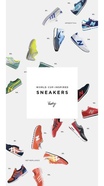
A clean, minimalist 9:16 layout featuring an array of running shoes organized by theme, using a white background to emphasize product variety and color.
Free credits included. No card required
The running shoe ad creative employs a sophisticated grid-based layout to present a broad collection without overwhelming the viewer. By organizing products in a sparse, minimalist white space, the ad creates a premium browsing experience that allows individual colorway details to pop against the neutral background.
This visual strategy succeeds by turning a standard product catalog into a cohesive, high-fashion editorial, which for most ecommerce teams reduces cognitive load compared to crowded displays. Using Promer AI, you can replicate this structured, aspirational aesthetic to present your own product lineup, though performance will vary based on your brand's specific audience targeting.
Great ads start from an idea, a feeling, or a structure, not a blank design.
Pro tip
Apply this grid technique to highlight variety rather than depth, such as seasonal color drops or collection previews. If you are showcasing a large inventory, limit the number of items shown to ensure each product retains enough visual presence on smaller mobile screens.




















Promer helps you find the pattern, adapt it to your product, and create your own version in minutes.






