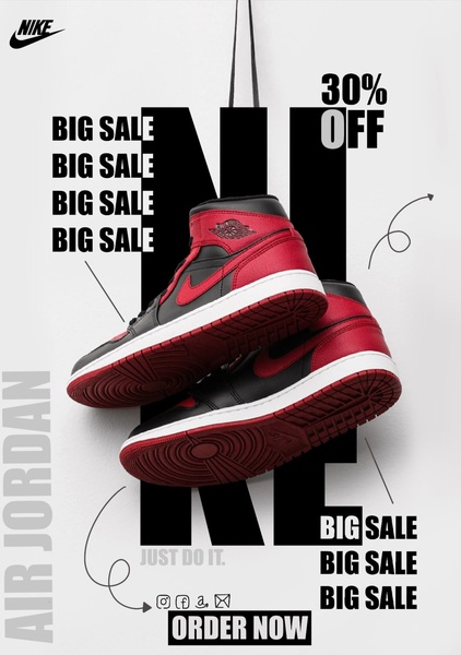
A high-contrast advertisement for running shoes featuring a 30% off discount, heavy black-on-white typography, and a centered product presentation.
Free credits included. No card required
This running shoe ad creative succeeds by leveraging high-contrast typography to anchor the viewer's attention directly on the promotional offer. By using a minimalist white background, the brand ensures the red-and-black product pops, allowing the aggressive 'BIG SALE' repetition to create a sense of urgency without cluttering the visual space. The strategy relies on forced visual hierarchy where the discount percentage serves as the primary gateway for customer interest.
For most ecommerce teams, this structure is a repeatable pattern for seasonal inventory clearing because it avoids complex scene-building. When you use Promer AI to replicate this layout, you remove the guesswork from balancing product imagery with sales copy, ensuring your offer remains the focal point regardless of the shoe design or colorway.
Great ads start from a clear visual structure that subordinates design elements to the core promotional offer.
Pro tip
When using a bold, text-heavy layout like this for your running shoe ads, ensure the dominant color of your footwear contrasts sharply with the background. If your product is primarily black, consider using a colored overlay or glow effect to maintain the visual pop that makes this creative effective.




















Promer helps you find the pattern, adapt it to your product, and create your own version in minutes.






