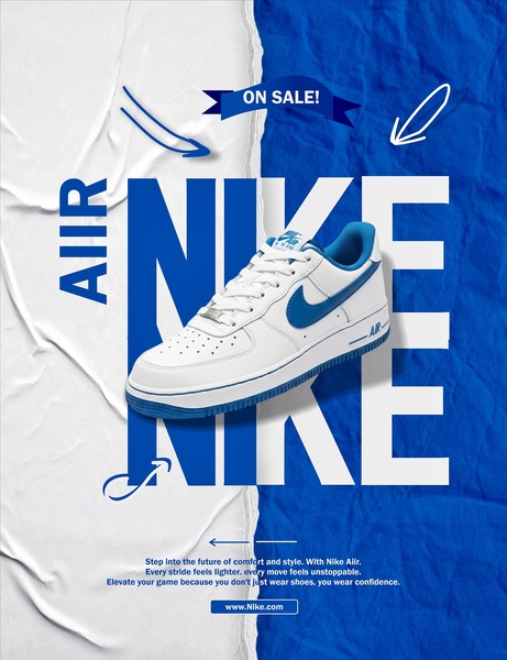
A split-screen design featuring a prominent sneaker product shot, bold oversized typography, and a clear sale hook for high visibility.
Free credits included. No card required
This running shoe ad creative uses a bold, split-screen design to immediately separate the product from the brand messaging. By anchoring the sneaker in the center of a high-contrast white and blue background, the brand directs the viewer's eye to the product while utilizing the oversized 'NIKE' text as a graphic element that reinforces brand recall without distracting from the offer. The core of this strategy lies in prioritizing visual simplicity to lower the cognitive load on the viewer during rapid social media scrolling.
For most ecommerce teams, this type of structured layout ensures that the product image and the promotion are consumed simultaneously, preventing the common issue of buried messaging. When testing new assets with Promer AI, maintaining this balance between visual space and textual clarity often leads to higher click-through rates. Depending on your specific product category, the high-contrast color scheme works well to create a sense of urgency and professionalism that feels inherently native to the platform.
Great ads start from an idea, a feeling, or a structure, not a blank design.
Pro tip
For sneaker brands, ensure the lighting on the product aligns with your background contrast to avoid the product feeling 'pasted on.' You can use high-contrast shadows to ground the product naturally, making it appear part of the environment even in heavily stylized ad templates.




















Promer helps you find the pattern, adapt it to your product, and create your own version in minutes.






