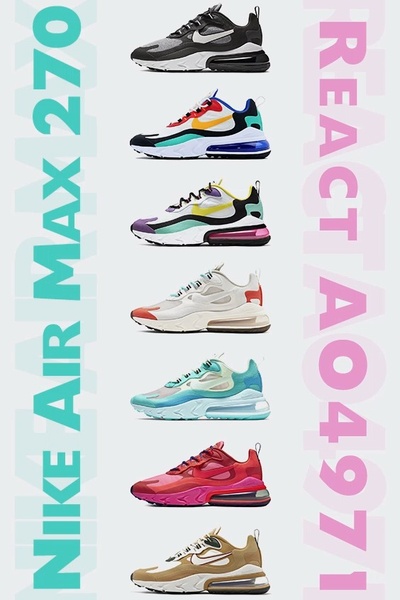
A clean vertical layout presenting multiple colorways of a running shoe model in a 2:3 ratio grid.
Free credits included. No card required
This running shoe ad creative uses a high-contrast vertical grid to organize multiple product variations into a single, cohesive visual flow. By displaying a variety of colorways in a uniform, vertical sequence, the design lowers cognitive load while maximizing the aesthetic impact of the product catalog. This approach works well for apparel and footwear brands because it allows potential customers to instantly compare styles without clicking through multiple pages.
For most ecommerce teams, this structure is a reliable way to capture interest across different aesthetic preferences within a single frame. Using Promer AI, you can replicate this organized, multi-product layout by mapping your own inventory into a similar grid structure. It shifts the focus from a single item to the breadth of your collection, which often increases the likelihood of finding a style that resonates with each specific viewer.
Great product ads often rely on clean, repeatable grid structures rather than complex, cluttered designs.
Pro tip
To increase the effectiveness of a grid layout, consider placing your best-selling or most vibrant colorway in the middle of the stack. This acts as a visual anchor that draws the eye toward the center before the viewer scans the rest of your product range.




















Promer helps you find the pattern, adapt it to your product, and create your own version in minutes.






