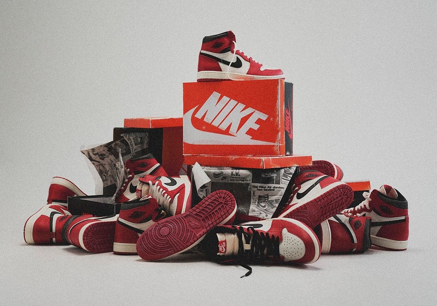
A high-contrast arrangement of a single running shoe model placed on and around its own branded packaging box against a neutral backdrop.
Free credits included. No card required
This running shoe ad creative leverages a visual hierarchy strategy that immediately draws the eye to the product by using a central, elevated focal point. By placing the sneaker atop its own branded box and surrounding it with matching inventory, the creative establishes an authentic, premium feel that signals quality without relying on cluttered graphics or aggressive sales copy. Using a structured, clean composition allows the product's design and color palette to communicate value to the consumer naturally.
For most ecommerce teams, this pattern is effective because it reduces cognitive load while highlighting the physical details of the item. You can achieve this same high-converting balance using Promer AI to refine your product staging and ensure your visual storytelling aligns with your brand's core identity. Adopting a clear, consistent staging approach often helps sustain performance when scaling, though results may vary based on your audience segment.
Great ads start from a clear visual concept that allows the product itself to perform as the hero of the story.
Pro tip
Vary the density of the background items to test which composition style drives higher click-through rates. A slightly more sparse arrangement can sometimes signal exclusivity, while a denser 'stacked' look often communicates high demand or a new product launch.




















Promer helps you find the pattern, adapt it to your product, and create your own version in minutes.






