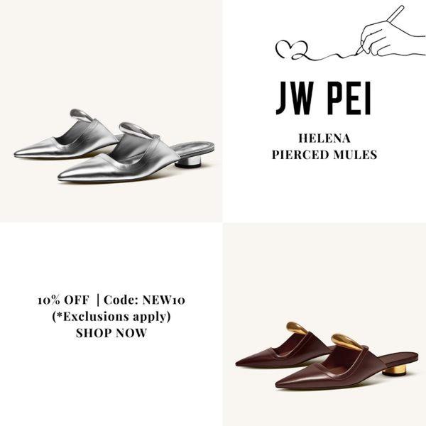
This ad creative utilizes a balanced 1:1 grid layout to showcase two different color variations of pierced mules with a clear discount offer.
Free credits included. No card required
This Pierced Mules ad creative leverages a minimalist, high-key grid layout to reduce visual noise and place total focus on the product features. By using a split-pane structure to showcase multiple color variations, the design creates a sense of variety and accessibility without requiring complex video or motion elements.
This pattern works effectively for accessory brands because it prioritizes product clarity over lifestyle clutter, allowing customers to instantly evaluate the design and aesthetic. For most ecommerce teams, Promer AI provides the tools to replicate this structured approach by quickly swapping in your own product imagery and brand assets.
Great ads start from an idea, a feeling, or a structure, not a blank design.
Pro tip
When using a grid layout, always ensure the lighting profiles across all product variants remain consistent. If your product shots vary significantly in exposure, the ad can feel disjointed and lose its professional, luxury appeal.




















Promer helps you find the pattern, adapt it to your product, and create your own version in minutes.






