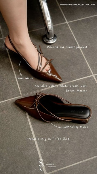
A high-clarity, vertical product showcase featuring two variations of mules with direct labeling and color availability for simplified shopping.
Free credits included. No card required
This mules ad creative leverages a minimalist, top-down perspective to eliminate visual clutter, focusing the user's attention entirely on the silhouette and construction of the footwear. By pairing direct product labeling with clear inventory callouts, the design effectively mimics a digital catalog, which reduces cognitive friction and accelerates the purchase decision process for high-intent shoppers.
For most ecommerce teams, this structure works because it prioritizes clarity over heavy branding, allowing the product's design to serve as the hook. Using Promer AI, you can replicate this clean, informative layout for your own catalog, ensuring your ad creative maintains a consistent visual language that builds trust with your audience.
Great ads start from a clear product structure that tells the viewer exactly what they are looking at and where to find it.
Pro tip
When using direct labeling as a hook, ensure your typography is high-contrast and readable against your floor background. A simple, thin sans-serif font keeps the ad looking premium and prevents the text from overwhelming the actual product photography.




















Promer helps you find the pattern, adapt it to your product, and create your own version in minutes.






