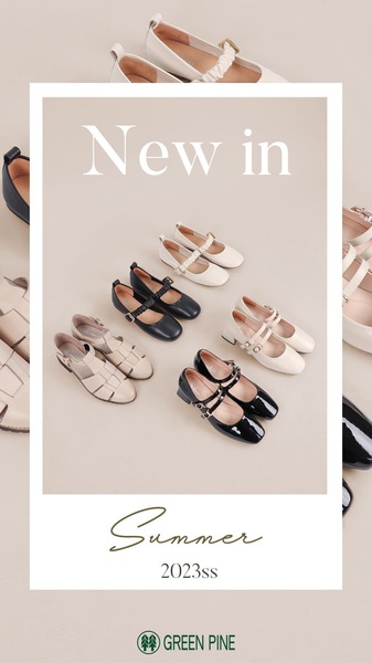
A clean, minimalist grid display of Mary Jane shoes on a neutral background, highlighting the latest seasonal collection.
Free credits included. No card required
This Mary Jane shoe ad creative leverages a minimalist, organized visual structure that communicates brand quality without clutter. By using a clean, neutral background, the ad ensures the focus remains entirely on the varied textures and styles of the shoes, which is effective for high-intent fashion shoppers. The combination of rhythmic product placement and seasonal messaging creates a sense of immediate availability and desire.
Adopting this clean grid approach allows brands to showcase an entire collection in a single frame, reducing visual friction and keeping the user's attention anchored on product selection. When you use Promer AI to analyze or replicate this style, you are leveraging a proven framework that prioritizes visual clarity, which typically outperforms dense or busy product collages for most ecommerce teams.
A perfectly curated grid is more persuasive than a product feature list because it allows the customer to visualize their entire collection at once.
Pro tip
When using a grid layout, consider adding a single 'hero' shoe that slightly breaks the grid pattern or features a unique lighting effect. This subtle disruption encourages the eye to pause, increasing the dwell time on your ad significantly.




















Promer helps you find the pattern, adapt it to your product, and create your own version in minutes.






