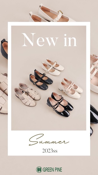
A clean, minimalist 9:16 layout showcasing a variety of new season Mary Jane shoe styles in a soft neutral palette.
Free credits included. No card required
This Mary Jane shoe ad creative leverages a clean, minimalist grid layout to emphasize the variety of the collection without visual noise. By using a soft, neutral background, the brand ensures the textures and shapes of the footwear remain the central focus, which is a classic tactic for high-end accessories. The intentional use of negative space allows the product-heavy composition to feel premium rather than cluttered.
For ecommerce teams looking to refresh their seasonal catalogs, Promer AI provides the tools to replicate this structured approach. Using a standardized layout helps the audience quickly scan multiple variations, which can lower bounce rates when the visual hierarchy is as clear as it is here, though performance typically varies by brand authority.
A successful product showcase relies on the balance between visual density and intentional negative space to guide the viewer's eye.
Pro tip
When using a grid layout for footwear, ensure your lighting consistency remains high across all product photos to maintain a cohesive look. Small discrepancies in image brightness between items in the grid can break the professional aesthetic.




















Promer helps you find the pattern, adapt it to your product, and create your own version in minutes.






