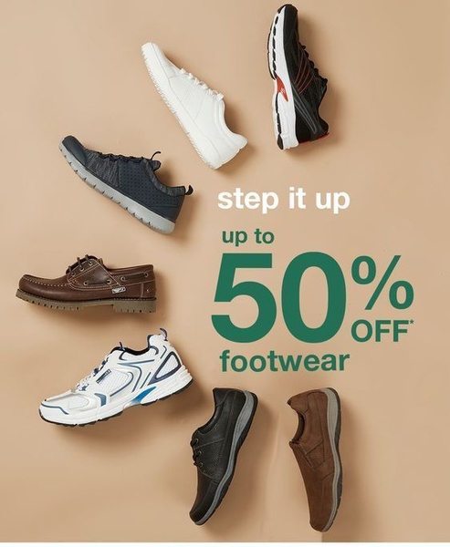
A minimalist, flat-lay arrangement of various shoe styles against a neutral background, highlighting a 50% off discount.
Free credits included. No card required
This footwear ad creative excels by utilizing a balanced grid layout that allows the product variety to shine without overwhelming the viewer. By anchoring the primary offer in the negative space between products, the design creates an intuitive reading path that draws the eye directly to the value proposition. This structural choice effectively minimizes cognitive load, making the offer easy to digest for mobile scrollers.
Using a clean, neutral background provides a premium feel that works for most ecommerce teams regardless of their specific aesthetic. For brands looking to replicate this organized visual hierarchy, Promer AI offers tools to standardize product presentation and test different promotional angles. This approach succeeds because it treats the products as a curated collection rather than a cluttered catalog, which typically increases click-through rates for seasonal sales.
Great ads start from an idea, a feeling, or a structure, not a blank design.
Pro tip
When using a grid layout, ensure your product photos have a consistent shadow depth and angle to maintain the illusion of a single photoshoot. This prevents the creative from feeling like a random collage and helps establish brand authority.




















Promer helps you find the pattern, adapt it to your product, and create your own version in minutes.






