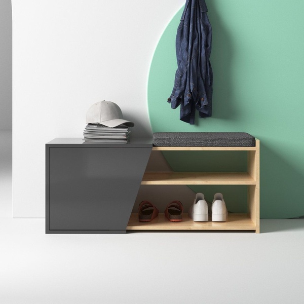
A clean, minimalist product hero shot of an entryway bench, emphasizing organizational storage and a modern aesthetic.
Free credits included. No card required
This entryway bench ad creative uses a minimalist composition and high-contrast color blocking to create immediate visual clarity. By pairing a neutral, functional product against an asymmetrical geometric background, the layout avoids cluttered noise and allows the product to function as the sole hero. Focusing on negative space in your ad creative reduces cognitive load and directs the viewer's eye exactly where you want it: on the product's design features.
This aesthetic, which you can easily replicate with Promer AI, works because it signals order and cleanliness to the viewer immediately. For most furniture brands, showing an organized environment creates an aspirational appeal that drives higher engagement than aggressive, text-heavy designs. Always consider how your product fits into an idealized lifestyle scenario when setting your creative concept.
A well-staged product is the strongest hook you have; the environment should support the product, not compete with it.
Pro tip
When using a split background like this one, ensure your brand's primary color isn't so vibrant that it distracts from the product itself. In most cases, keeping the product's natural colors as the anchor point while using the background to set the 'mood' yields the best results.




















Promer helps you find the pattern, adapt it to your product, and create your own version in minutes.






