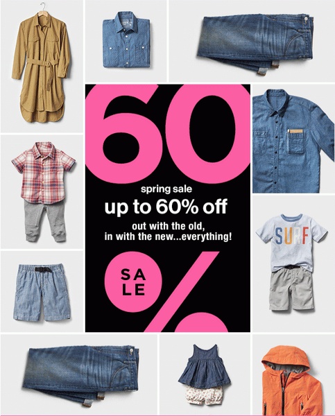
A 4:5 collage layout showcasing various children's apparel items surrounding a high-contrast central offer block announcing a 60% off spring sale.
Free credits included. No card required
This children's clothing ad creative utilizes a high-contrast, grid-based layout to organize a diverse product collection around a singular, massive promotional call-to-action. By leveraging a bold hot-pink and black color scheme, the ad ensures the discount percentage remains the dominant focal point for the scroller. The combination of clear, concise messaging and a structured collage creates a sense of seasonal transition and abundance that drives high click-through rates.
For most ecommerce teams, this pattern works because it avoids clutter while still showcasing a variety of inventory, which is crucial for seasonal clear-out campaigns. You can leverage the Promer AI platform to adopt this specific grid structure for your own collections, ensuring that your core offer remains the anchor for your creative performance.
Great ads start from a central idea or feeling that bridges the gap between your inventory and your customer's urgency.
Pro tip
When using a grid layout, ensure the colors of your product photography do not clash with your central offer block. Balance neutral product backgrounds with a high-vibrancy accent color in your typography to maintain a clean, professional aesthetic.




















Promer helps you find the pattern, adapt it to your product, and create your own version in minutes.






