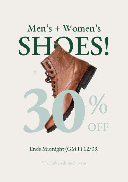
A clean, minimalist 30% off promotional ad for boots that uses clear typography and high-contrast product imagery to drive conversions.
Free credits included. No card required
This boot sale ad creative succeeds by stripping away visual clutter to place the product and the offer on equal footing. By utilizing a high-contrast color palette and large, clean typography, the ad ensures that the 30% discount is the first thing a user sees while scrolling, creating an immediate, high-intent value proposition.
This minimalist pattern is effective for fashion-forward brands because it removes friction between the user and the offer. Using Promer AI, performance teams can replicate this structured, clear layout to test different product angles or seasonal sales without needing to reinvent the design from scratch.
Great ads start from an idea, a feeling, or a structure, not a blank design.
Pro tip
When running a direct-offer ad, ensure your product photo is isolated on a clean, high-contrast background to maintain the minimalist aesthetic. If your product is busy or patterned, use a more muted or solid background color to keep the text legible and the hook punchy.




















Promer helps you find the pattern, adapt it to your product, and create your own version in minutes.






