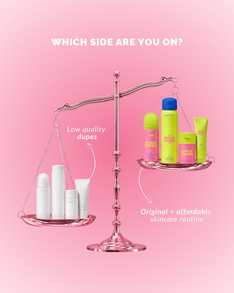
A high-contrast comparison visual featuring a physical scale to differentiate branded skincare products from generic alternatives.
Free credits included. No card required
This skincare routine ad creative utilizes a classic comparison scale to create immediate visual tension between the brand and generic alternatives. By positioning the product as the premium yet affordable choice against 'low quality dupes,' it forces the viewer to choose a side, which is a powerful way to reinforce brand identity through direct product polarization.
This approach works because it simplifies a complex buying decision into a binary, relatable choice that captures attention within the first second of a scroll. For most teams, leveraging a tool like Promer AI allows you to test similar 'us vs them' frames with your own product assets, ensuring your visual hierarchy remains as clear and impactful as the one shown here.
Great ads are built on a clear, polarizing premise that forces the customer to decide which camp they belong to.
Pro tip
When running comparison ads, ensure the 'low quality' side of your creative remains abstract or non-descriptive to avoid legal sensitivities. Use the balance scale to represent a conceptual quality gap rather than calling out specific competitors.
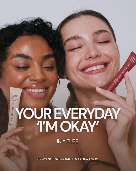
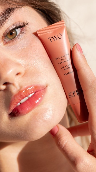




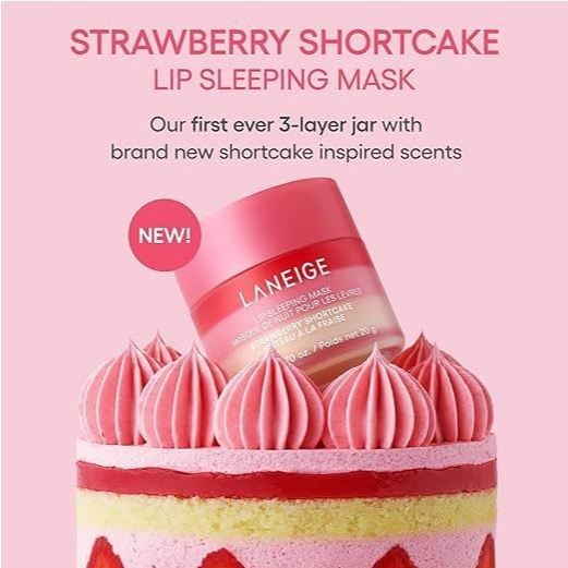












Promer helps you find the pattern, adapt it to your product, and create your own version in minutes.






