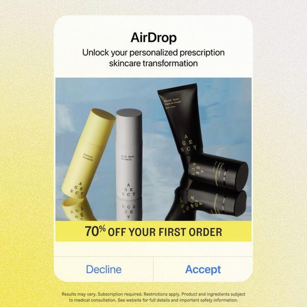
A clean, mobile-native interface design featuring skincare products paired with a high-value discount offer.
Free credits included. No card required
This prescription skincare ad creative succeeds by leveraging a familiar UI hook to minimize user friction during the scroll. By mimicking a native mobile system notification, the ad disrupts the feed in a way that feels functional rather than promotional, allowing the brand to present their product suite as a utility or software solution. Using a minimalist visual style with high-contrast, distinct product photography against a clean blue background keeps the cognitive load low, which is ideal for communicating complex medical-grade beauty products. Utilizing tools like Promer AI allows performance teams to experiment with these UI-inspired structures to see if they resonate better than traditional lifestyle photography for their specific product categories. For most teams, the effectiveness of this approach often hinges on the clarity of the value proposition being framed within the familiar interface container.
The most effective ads don't look like ads; they borrow patterns from the tools and interfaces your customers use every single day.
Pro tip
To boost engagement further, consider animating the 'Accept' button to pulse or glow, drawing the eye toward the CTA. In some cases, testing an interface hook that matches the device's native OS style can significantly increase click-through rates compared to generic ad designs.
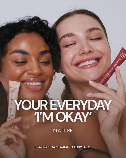
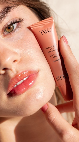
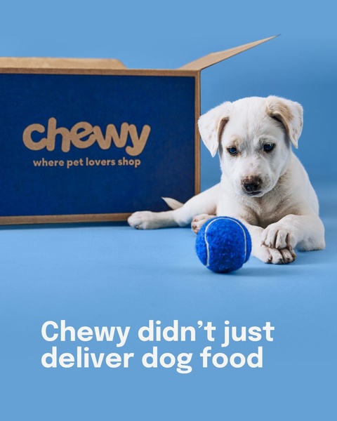





Promer helps you find the pattern, adapt it to your product, and create your own version in minutes.






