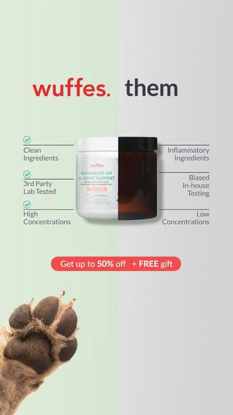
A vertical 9:16 split-screen graphic contrasting a premium supplement brand against generic, low-quality alternatives using a checkmark versus cross system.
Free credits included. No card required
This Hip & Joint Supplement ad creative utilizes a clear 'Us vs. Them' visual narrative to establish immediate brand superiority. By splitting the frame into a clean, light side and a dark, obscured side, the brand makes it visually intuitive for customers to associate their product with quality and transparency while positioning competitors as inherently inferior choices.
This pattern works because it removes the cognitive friction associated with ingredient lists. Using Promer AI to mirror this structural approach allows teams to quickly communicate product benefits without relying on wall-of-text copy, which is essential for short-form mobile placements where scroll-stop is the primary objective.
Great creative is not about decoration; it is about simplifying a complex buying decision into a single glance.
Pro tip
When using a binary comparison, ensure the 'Us' side features high-quality, bright lifestyle photography of your product to further differentiate from the dark, muted aesthetic of the 'Them' side. This subtle emotional cue validates the rational ingredient list presented on the screen.












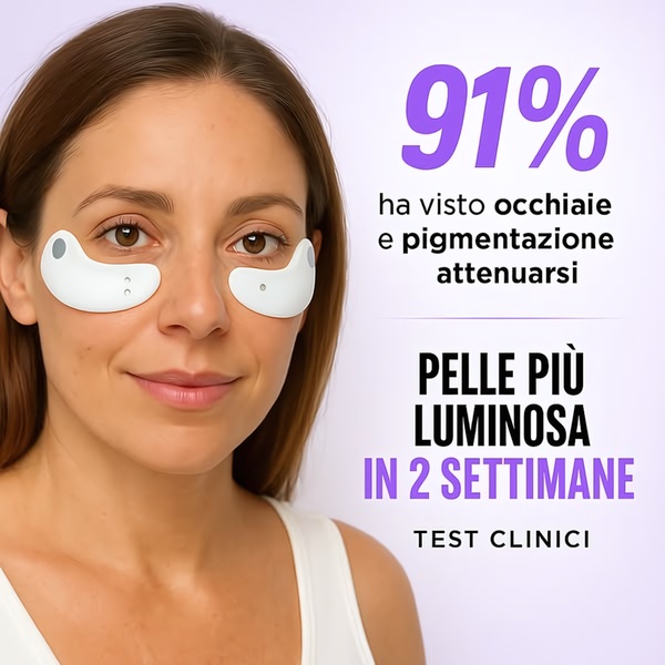







Promer helps you find the pattern, adapt it to your product, and create your own version in minutes.






