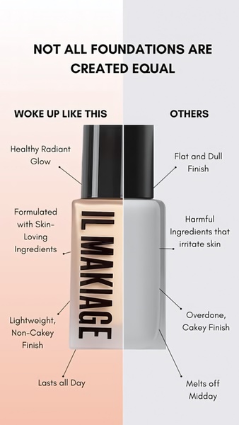
A side-by-side comparison creative for a foundation product that contrasts the brand's skin-loving, long-lasting formula against typical dull, cakey alternatives.
Free credits included. No card required
This foundation ad creative utilizes a high-contrast split-screen layout to instantly communicate the superior performance of the product over generic market alternatives. By framing the product as a solution to common pain points—such as cakey finishes or short-lived coverage—the creative forces the viewer to self-identify with a need for a higher quality option.
This structural pattern is highly effective for beauty brands because it simplifies complex product benefits into a quick, readable format for Promer AI users aiming to drive conversions. In most cases, relying on a clean, binary comparison helps viewers process value propositions in less than two seconds, keeping retention high on mobile feeds.
Great advertising is less about complex design and more about presenting a clear, undeniable choice to the consumer.
Pro tip
To increase credibility in a comparison ad, use data-backed or ingredient-specific language instead of generic adjectives. For example, specify why the product does not melt off instead of simply saying it lasts all day to give the viewer a concrete 'reason to believe'.








Promer helps you find the pattern, adapt it to your product, and create your own version in minutes.






