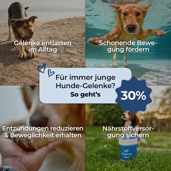
A 1:1 ratio ad creative using a four-panel grid to highlight specific mobility and health benefits of a dog supplement product.
Free credits included. No card required
This dog supplement ad creative utilizes a classic four-panel grid design to immediately communicate key product benefits without overwhelming the viewer. By combining distinct visual snapshots of happy, active dogs with clear benefit-focused text, the ad lowers cognitive load while reinforcing the product's value proposition through a clean, organized visual hierarchy. This approach provides an educational foundation that builds immediate brand trust with pet owners concerned about their dog's long-term mobility.
For most ecommerce teams, the grid layout works because it allows multiple entry points for the consumer to identify with the value of the product. Using Promer AI to analyze these layout structures helps brands understand how to segment information logically. This specific structure is effective for categories where health and longevity are primary concerns, though results will always vary depending on your specific target audience and the clarity of your visual imagery.
Great ads start from an idea, a feeling, or a structure, not a blank design.
Pro tip
When using a grid layout, ensure the visual focal point in each quadrant is high-contrast to prevent the design from feeling cluttered. This structure works best when every panel clearly links back to the primary problem identified in your center headline.















Promer helps you find the pattern, adapt it to your product, and create your own version in minutes.






