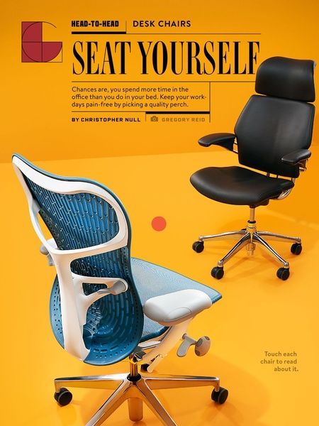
A split-view ad comparing two office chair designs against a high-contrast yellow background to emphasize aesthetic and comfort options.
Free credits included. No card required
This Desk Chair ad creative effectively uses a bold, monochromatic background to anchor the product visual, ensuring the viewer focuses immediately on the chair designs. By positioning the ad as an educational 'Head-to-Head' comparison, the brand frames the furniture as a vital tool for health rather than just an office accessory, which is a powerful way to reduce purchase hesitation for high-ticket items.
Performance teams often find that pairing a strong pain-point hook like 'spend more time in the office than your bed' with a visual that invites interaction creates a high-intent environment for buyers. You can use Promer AI to replicate this structured, feature-forward presentation for your own furniture catalog while maintaining the clean, minimalist aesthetic shown here.
Great ads are built on the foundation of a specific user problem, ensuring that every design choice points back to the solution.
Pro tip
To boost conversions on comparison ads, ensure your secondary copy highlights the distinct differences between products, such as lumbar support versus breathability. Always test at least three variations of your hook to see which pain point—physical discomfort or aesthetic upgrade—resonates more deeply with your target demographic.

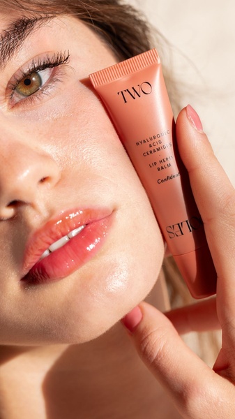




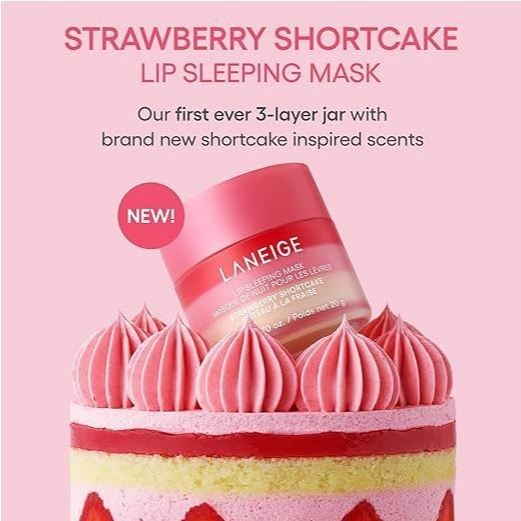
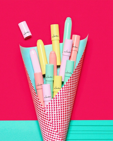








Promer helps you find the pattern, adapt it to your product, and create your own version in minutes.






