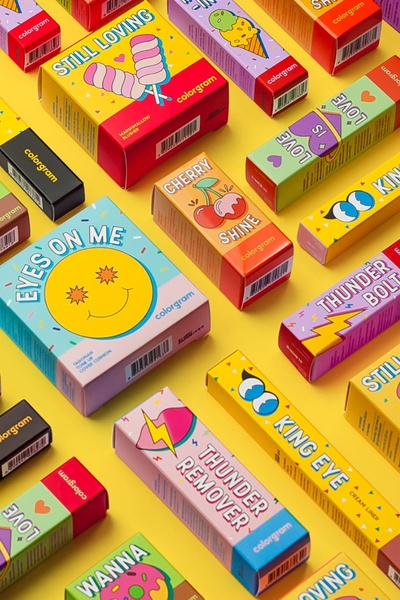
A vibrant, top-down flat lay composition featuring multiple cosmetic product boxes arranged in a patterned grid against a solid yellow background.
Free credits included. No card required
This cosmetic packaging ad creative leverages a high-contrast, structured grid layout to dominate the screen and capture immediate attention. The repetitive, colorful pattern acts as a visual hook that disrupts the scrolling experience, rewarding users with an organized, high-energy display of the full product range that feels both curated and premium. By isolating the products against a bold, singular background, the brand emphasizes the distinct personality of each item without relying on distracting lifestyle imagery.
For most ecommerce brands, this approach works because it transforms individual product units into a cohesive collection that signals depth and variety. Teams looking to test this high-density layout should utilize Promer AI to maintain consistent brand aesthetics across all product variations. This structured visual framing typically performs well when you need to drive interest for a launch or a multi-SKU collection while keeping the customer focused on the product itself.
A winning ad structure begins with a clear visual strategy that organizes your products into a recognizable pattern, not just a random collection of items.
Pro tip
When using a grid-style hook, keep your lighting consistent across all product items to ensure the flat lay looks professional rather than cluttered. High-contrast backgrounds like the yellow used here are powerful, but ensure your text overlays are placed in negative space to maintain readability.






Promer helps you find the pattern, adapt it to your product, and create your own version in minutes.






