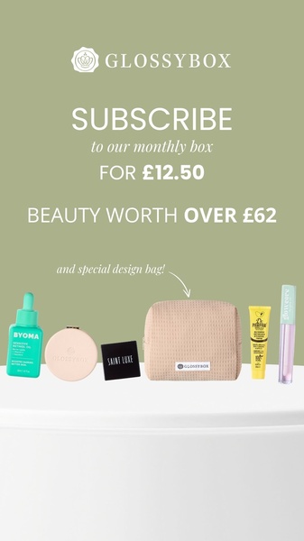
A clean, minimalist 9:16 layout showcasing a monthly beauty box contents alongside a strong monetary value proposition.
Free credits included. No card required
This beauty box ad creative uses a direct, value-first approach that immediately addresses the consumer's primary desire: high perceived worth for a low entry price. By isolating the product array against a clean, calming sage background, the visual design avoids clutter and lets the offer numbers—the £12.50 price point versus the £62 total value—do the heavy lifting of persuasion. The structure hinges on contrast, clearly signaling the gap between cost and benefit to create an instant value proposition that requires no mental gymnastics from the viewer.
Adopting this minimalist, value-led pattern is effective for beauty box subscriptions because it minimizes friction during the discovery phase. Using Promer AI allows you to test this exact layout with your own product catalog, swapping the visual assets while maintaining the high-contrast text hierarchy. This approach typically performs well for brands focusing on high-volume acquisition, provided the difference between the subscription cost and the retail value remains compelling to your target audience.
A winning subscription ad doesn't just show the product; it demonstrates the mathematical advantage of joining the brand.
Pro tip
When testing this style, try varying the placement of the 'worth' callout. You might find that placing the total value closer to the CTA button increases click-through rates by reinforcing the decision right before the user commits to the click.
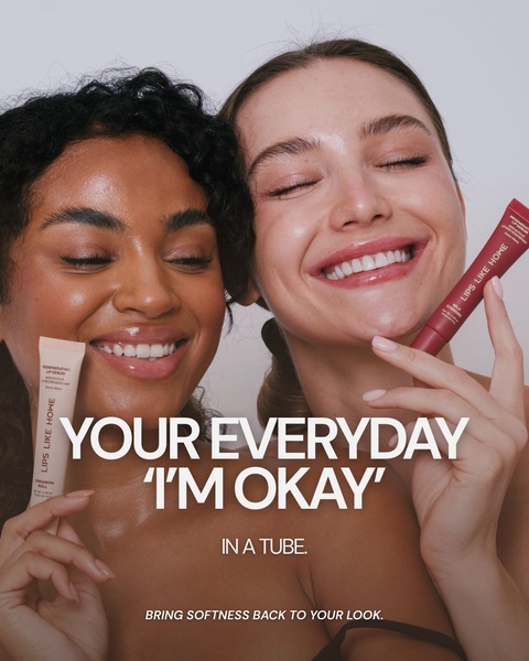
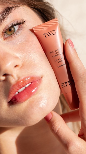


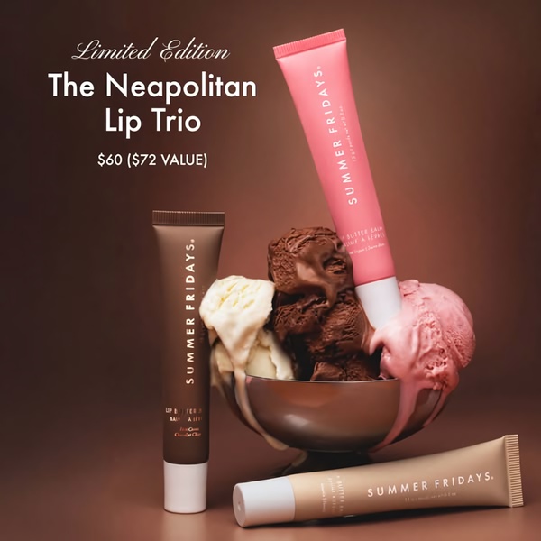









Promer helps you find the pattern, adapt it to your product, and create your own version in minutes.






