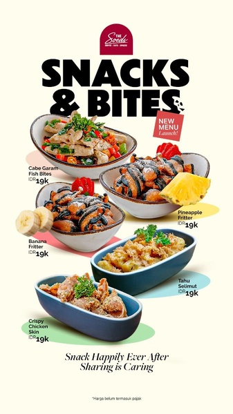
A vertical 9:16 menu board creative showcasing five distinct snack offerings with clear pricing and a brand-focused message.
Free credits included. No card required
The core of this layout lies in its structured presentation of a snack platter menu, which reduces cognitive load for the customer by isolating each food item. By using clean, pastel-colored backgrounds for each item, the ad creates a digestible visual hierarchy that encourages viewers to scan all offerings quickly without feeling overwhelmed by a wall of text.
This approach works because it mimics an easy-to-read physical menu, which is highly effective for food and beverage brands aiming to drive trial for new items. Promer AI often notes that for most restaurant owners, the key to high conversion is clarity; when your menu items are presented with consistent styling, your audience can immediately identify their preference and the associated price point.
A menu-style creative allows your product variety to serve as the hook itself, provided the visual organization remains clean and intuitive.
Pro tip
For food-focused ads, ensure your product photography follows a consistent angle—like the bowl-centered shots seen here—to keep the layout stable. If you switch between side profiles and top-down shots in the same grid, the overall aesthetic will lose its professional, menu-board feel.




















Promer helps you find the pattern, adapt it to your product, and create your own version in minutes.






