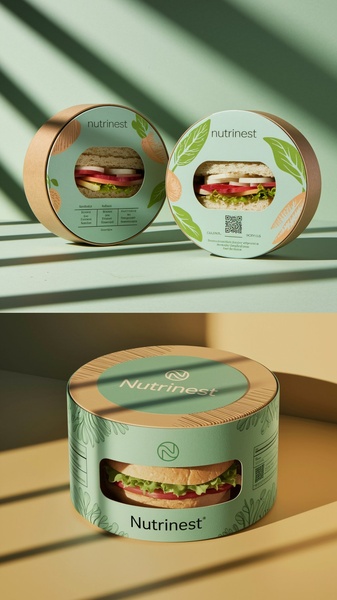
A high-end, minimalist presentation of sandwich packaging featuring natural tones and sustainable materials to emphasize product quality.
Free credits included. No card required
This creative focuses on the tactile appeal of the sandwich packaging by utilizing a clean, studio-lit environment that highlights the organic textures of the product. The choice of soft mint green against natural kraft brown creates an immediate sense of freshness and sustainability that stops the scroll for health-conscious audiences. By keeping the background simple and using harsh, aesthetic sunlight shadows, the ad directs the user's full attention to the product's quality and design.
Developing a high-performance visual strategy requires balancing brand aesthetics with clear product value, which is a core capability of Promer AI. This pattern works well for food brands that prioritize packaging experience, as it frames the product as a premium, ready-to-eat essential. In most cases, relying on cohesive, nature-inspired color palettes helps build instant trust with your consumer, reducing friction before they even engage with your headline or CTA.
Great ads start from an idea, a feeling, or a structure, rather than a blank canvas.
Pro tip
When focusing on sustainable packaging, ensure your lighting highlights the material texture, such as the grain of the cardboard. This tactile detail increases perceived value and aligns the viewer's expectations with the quality of the product inside.

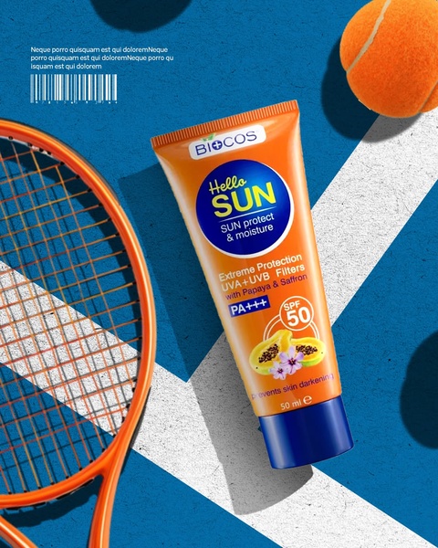
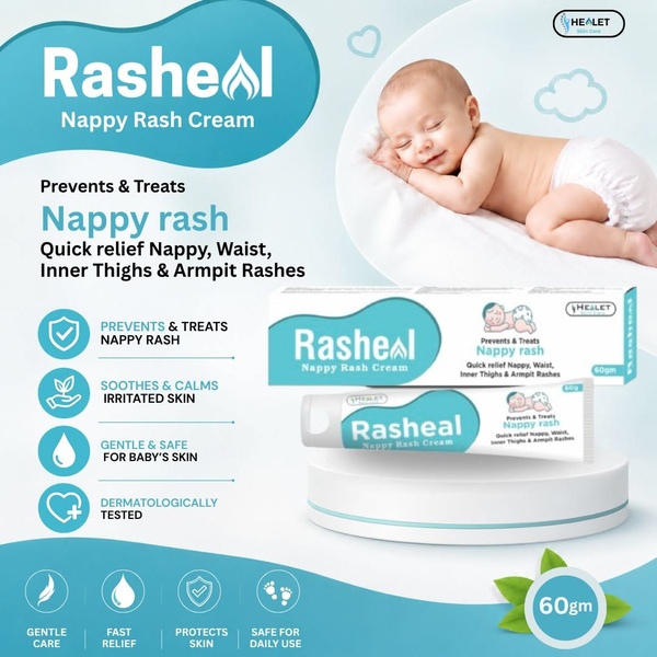


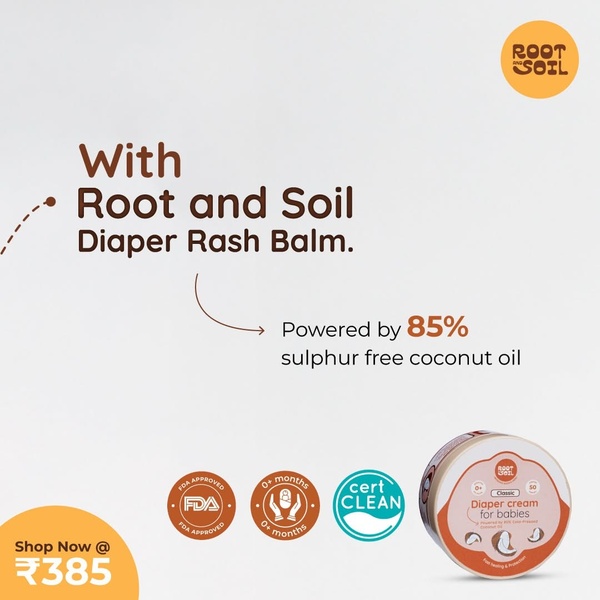
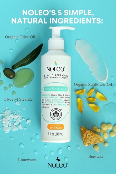

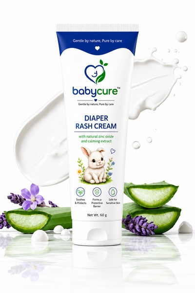

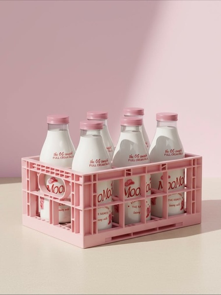
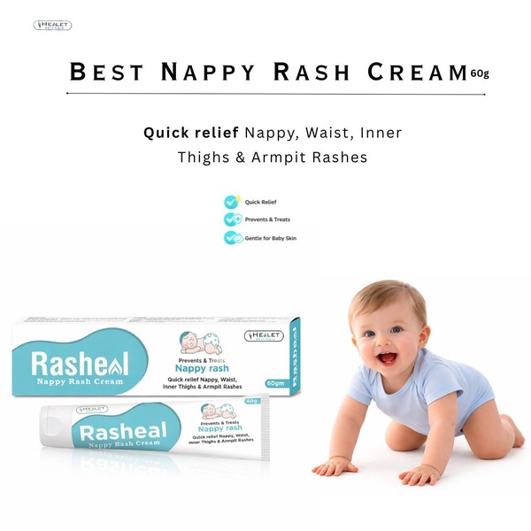

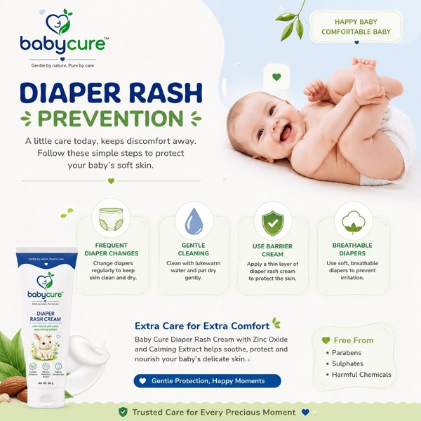

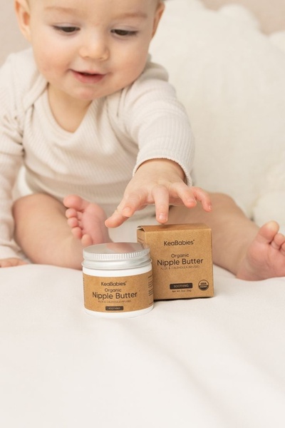




Promer helps you find the pattern, adapt it to your product, and create your own version in minutes.






