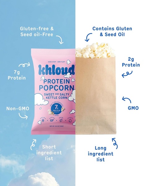
This creative uses a split-screen design to directly compare the brand's healthy protein popcorn against a generic alternative, emphasizing key nutritional differences.
Free credits included. No card required
This comparative layout for protein popcorn uses a split-screen visual to anchor the viewer's attention between two distinct product realities. By placing the brand's vibrant packaging against a neutral, generic bag, the ad forces an immediate value assessment based on simplified, high-contrast labels that highlight nutritional transparency.
The logic behind this structure is to reduce cognitive load by presenting complex health benefits through a simple, binary choice. For most ecommerce teams, using Promer AI to standardize this kind of direct comparison helps in crafting a clear 'Us vs. Them' narrative that typically resonates with health-conscious consumers who prioritize clean ingredients.
Great ads are built on clear, defensible contrast that allows the consumer to instantly categorize why your product is the better option.
Pro tip
When executing a comparison ad, ensure the 'generic' side remains visually bland but recognizable enough to be relatable. Do not use actual competitor logos, as it can look aggressive; instead, use descriptive text to frame the 'them' side as the standard, non-optimized alternative to your product.



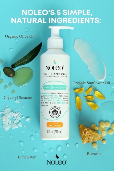

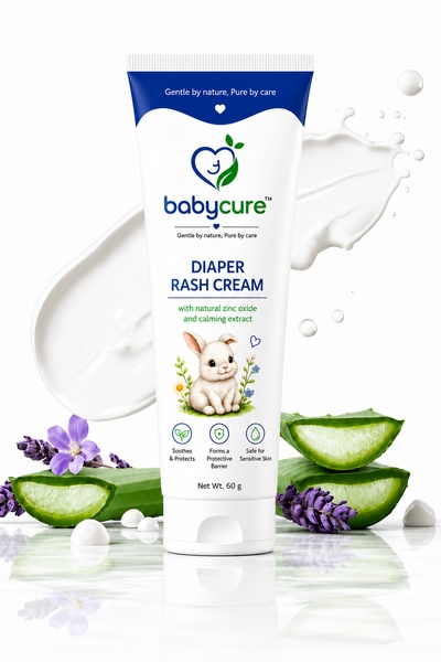

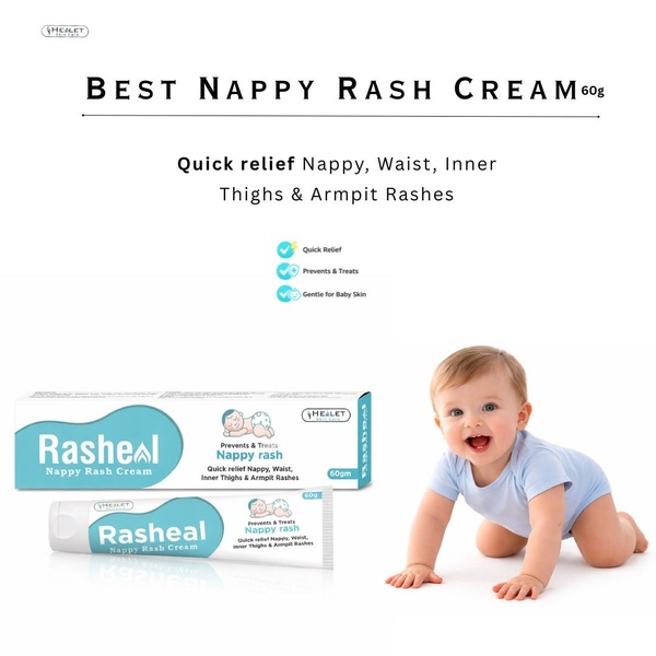




Promer helps you find the pattern, adapt it to your product, and create your own version in minutes.






