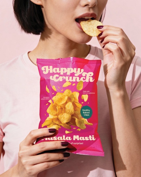
A close-up photograph featuring a person eating potato chips directly from the bag, emphasizing a clean, color-coordinated aesthetic.
Free credits included. No card required
This creative uses a lifestyle-centric hook that places the potato chips at the center of a vibrant, color-coordinated frame to trigger immediate viewer desire. By matching the product packaging color to the background and the model's outfit, the ad achieves a high-contrast, professional look that stands out in busy social feeds. The visual harmony between the snack packaging and the model creates a cohesive brand experience that elevates the perception of the product from a simple snack to a must-have lifestyle item.
For most ecommerce teams, this approach works because it removes visual clutter, letting the product take center stage without aggressive sales copy. Leveraging Promer AI allows you to test this type of clean, high-impact aesthetic across your own catalog. Always remember that visual consistency in background and clothing choices typically performs better when the product packaging itself is bold and colorful.
A powerful product ad is built on the strength of its visual hierarchy rather than just the density of its text.
Pro tip
If your product packaging features multiple colors, choose the most dominant one for the background to create a 'frame' effect. This simple color-locking technique consistently helps products pop in mobile feeds where users scroll through diverse content.

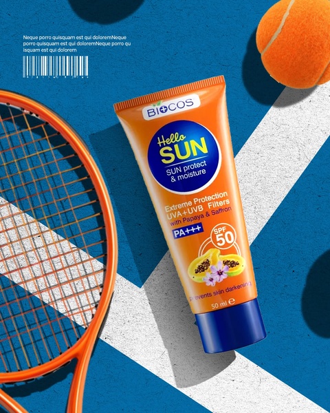
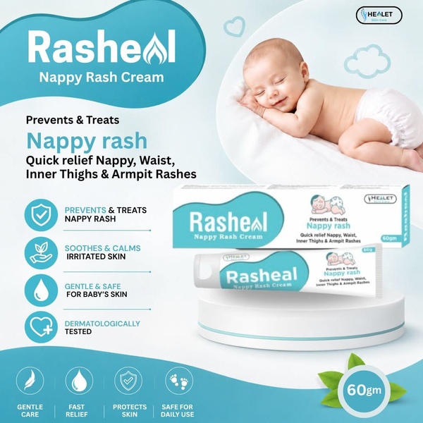
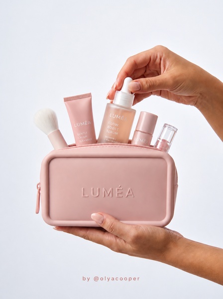







Promer helps you find the pattern, adapt it to your product, and create your own version in minutes.






