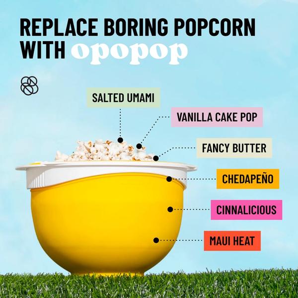
A bright, high-contrast product shot showing a yellow bowl filled with popcorn, with six flavor callouts pointing to the product to emphasize variety.
Free credits included. No card required
This creative utilizes a high-contrast, clean layout to immediately solve the problem of boring snack options. By anchoring the popcorn product subject with multiple flavor callouts, it effectively communicates variety and value without cluttering the visual space.
Strategic clarity often drives better performance than complex motion or heavy text overlays for consumer goods. At Promer AI, we find that simple, direct product-centric visuals consistently provide a reliable foundation for testing new messaging and flavor-focused value propositions.
A strong ad should visually communicate the primary benefit of your product in less than a second before any text is even read.
Pro tip
When using this layout, test different background colors to see which shade maximizes the pop of your product packaging. Keep the lines connecting your text to the product thin and clean to avoid detracting from the food itself.
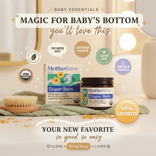
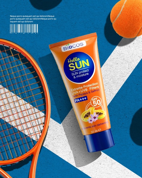
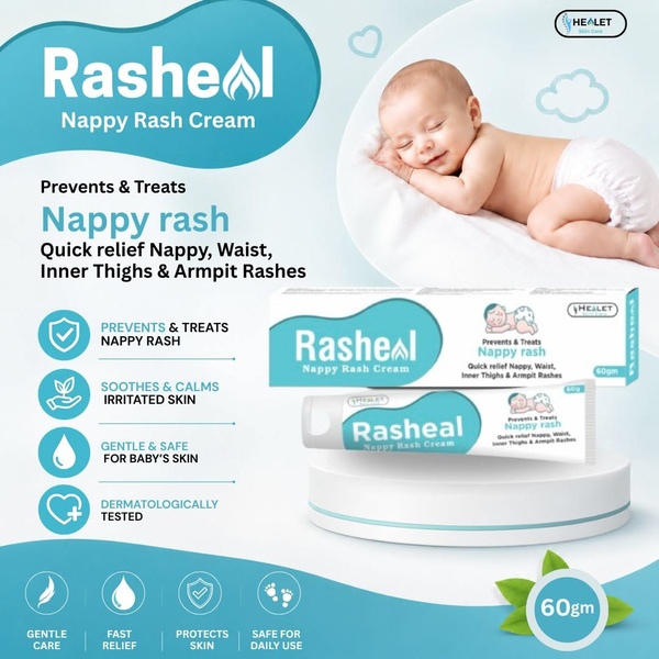
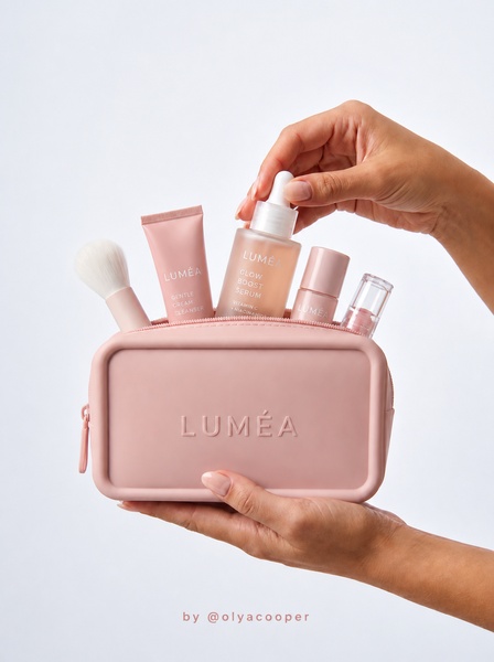

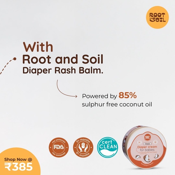
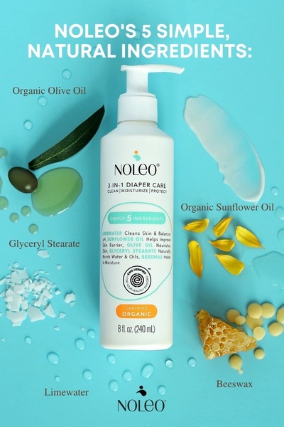
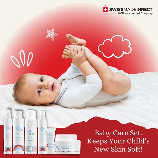
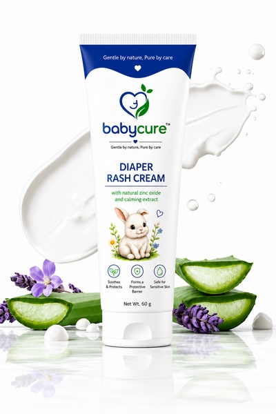

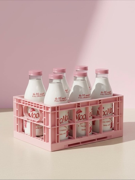
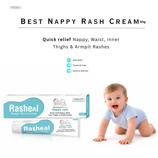
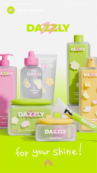
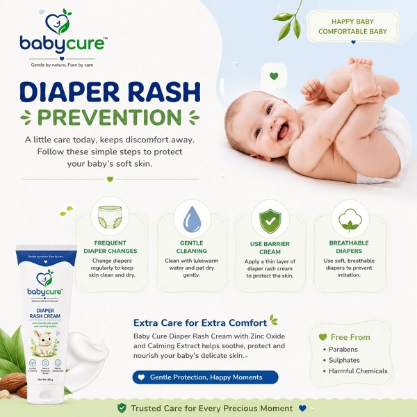
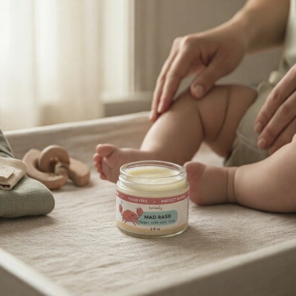
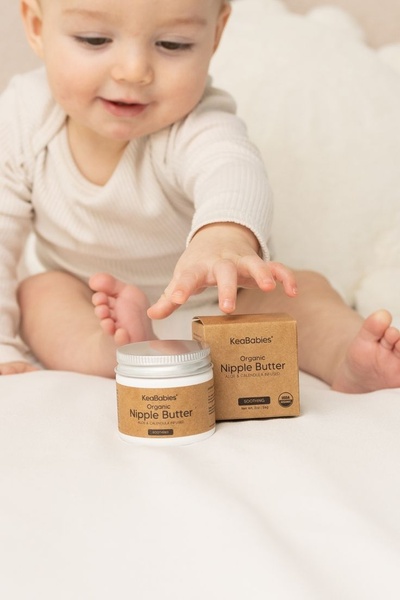
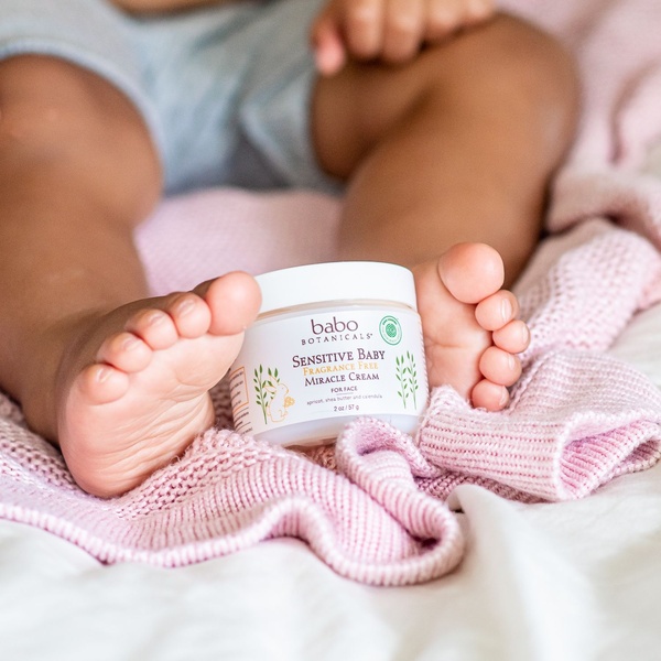
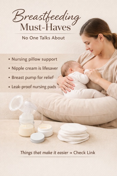
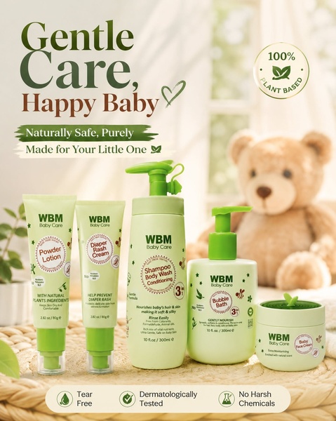
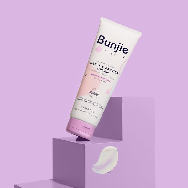
Promer helps you find the pattern, adapt it to your product, and create your own version in minutes.






