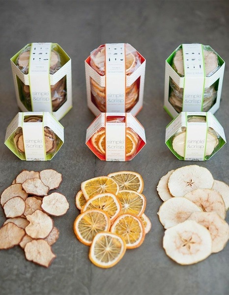
A high-angle studio shot showcasing three varieties of dried fruit slices in branded packaging alongside loose slices arranged in a neat grid pattern.
Free credits included. No card required
This ad creative highlights the premium quality of the dried fruit through a highly organized, symmetrical grid layout. By pairing the product packaging with the raw slices, the visual composition immediately tells the consumer exactly what is inside the box and how to use it for cocktail or food pairing. The use of a clean, minimalist aesthetic removes visual clutter and lets the natural texture and vibrant colors of the fruit become the primary hook for potential customers.
For most food and beverage brands, this approach works because it establishes immediate trust and product transparency before a single word of copy is read. By leveraging a structured Promer AI visual flow, ecommerce teams can ensure their products look as appetizing and professional as high-end photography without needing a full-scale studio production for every seasonal update.
Great ads start from an idea, a feeling, or a structure, not a blank design.
Pro tip
Vary your grid patterns based on the specific flavor or use-case you are highlighting. Using a consistent layout for different product lines creates a strong visual identity that makes your brand instantly recognizable in a fast-moving social feed.




















Promer helps you find the pattern, adapt it to your product, and create your own version in minutes.






