
This ad creative positions Chocolate Chikki as a superior, healthier alternative to traditional candy by using a bold direct comparison and crisp, appetizing imagery.
Free credits included. No card required
The Chocolate Chikki comparative strategy relies on a classic 'dump the old, upgrade to the new' framing that forces the viewer to re-evaluate their current snacking habits. By pairing a strong, polarizing headline with a clean, high-end studio shot of the product, the creative captures attention while simultaneously signaling that this is a superior, healthier, and more satisfying alternative to generic candy.
This pattern is effective because it provides an immediate value proposition that respects the user's intelligence and desire for healthier options. Using Promer AI to mirror this structural approach allows teams to test similar 'comparison-based' angles across their own product catalogs, typically resulting in higher engagement rates when the contrast between the 'old' way and the 'new' way is clearly articulated.
Great ads start from a clear psychological friction point, allowing the product to serve as the immediate, obvious solution to the viewer's problem.
Pro tip
When using a direct contrast hook, ensure your visual elements support the claim immediately. If you promise a 'crunch', your imagery should be hyper-focused on texture or the sound of the product, as this alignment between copy and visual payoff is what sustains conversion.

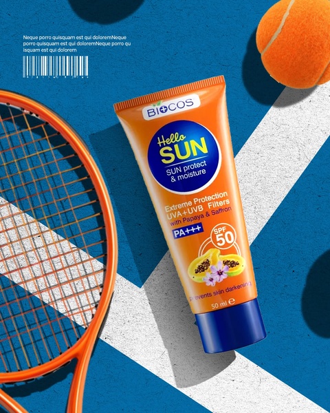
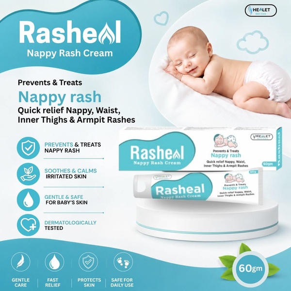





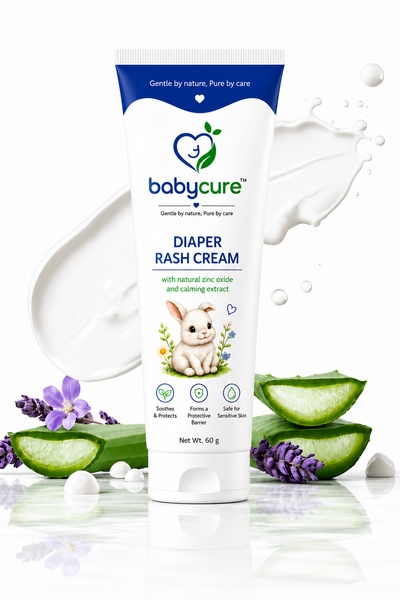

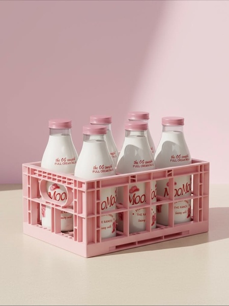





Promer helps you find the pattern, adapt it to your product, and create your own version in minutes.






