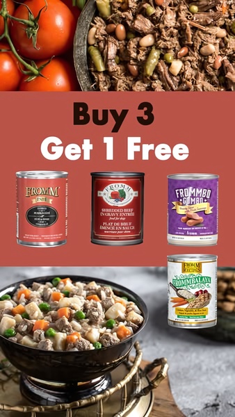
This static creative showcases a promotional offer for canned dog food using a grid layout that highlights the product variety against a clean, warm background.
Free credits included. No card required
This canned dog food ad succeeds by placing a high-value offer at the center of the frame, instantly communicating savings to the viewer. The grid layout reduces cognitive load, allowing customers to scan available product varieties while immediately understanding the 'Buy 3 Get 1 Free' incentive. By stripping away complex lifestyle imagery in favor of a clean, consistent color palette, the creative keeps the viewer focused on the purchasing decision rather than secondary details.
For most ecommerce teams, this structure represents a repeatable framework found on Promer AI. By pairing a punchy headline with a clear product grid, you isolate the conversion variable to your offer strength, making it easier to test different promotions without needing to rebuild your visual assets from scratch.
Great ads start from a clear offer structure that tells the viewer exactly what they gain in under two seconds.
Pro tip
When running offer-led ads, ensure the product imagery is consistent in size and orientation to maintain the grid's visual rhythm. Testing a single hero image versus a multi-product grid can reveal whether your customers prefer variety or deep dives into a single SKU.




















Promer helps you find the pattern, adapt it to your product, and create your own version in minutes.






