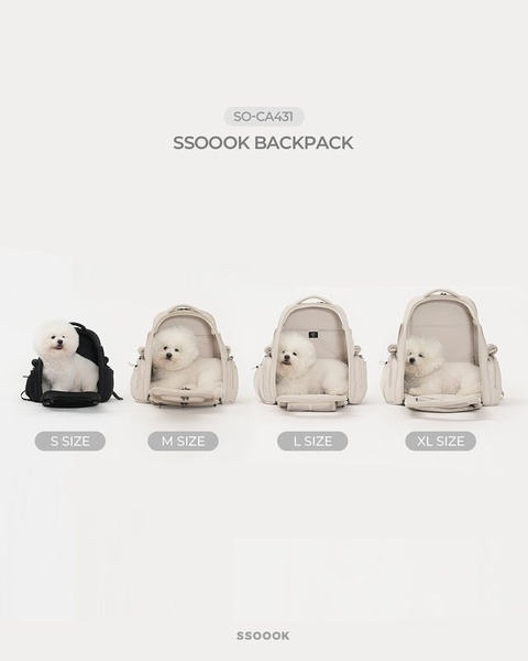
A clean, studio-lit side-by-side comparison of four different backpack sizes, each containing a white Bichon Frise to demonstrate scale.
Free credits included. No card required
This pet backpack ad creative employs a minimalist visual hierarchy that immediately solves the primary friction point for pet owners: sizing uncertainty. By placing a consistent subject across four distinct product variants, the design creates an instant, intuitive scale reference for the viewer without requiring them to read complex charts. The core strategy here is to trade dense copy for clear, observable visual utility.
For most ecommerce teams, reducing the cognitive load required to understand a product's utility is the most reliable way to boost click-through rates. By using a standardized studio background, the focus remains entirely on the backpack's form factor and volume. If you want to replicate this level of clarity with your own catalog, Promer AI provides the structural framework to normalize your product images into a similar, conversion-focused format.
Great ads start from an idea, a feeling, or a structure, not a blank design.
Pro tip
When running a product size comparison, ensure your subject is posed identically in every shot to avoid distorting the viewer's perception of volume. If your products are highly technical, layer a subtle shadow under each unit to ground them in the space and prevent the 'floating' effect that can make products look fake.
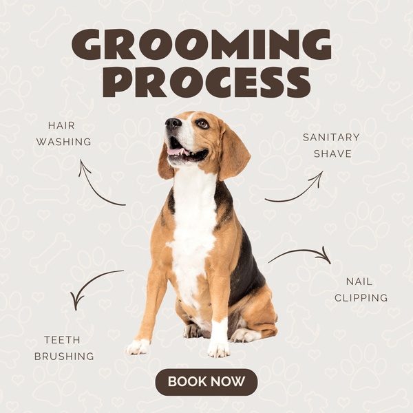
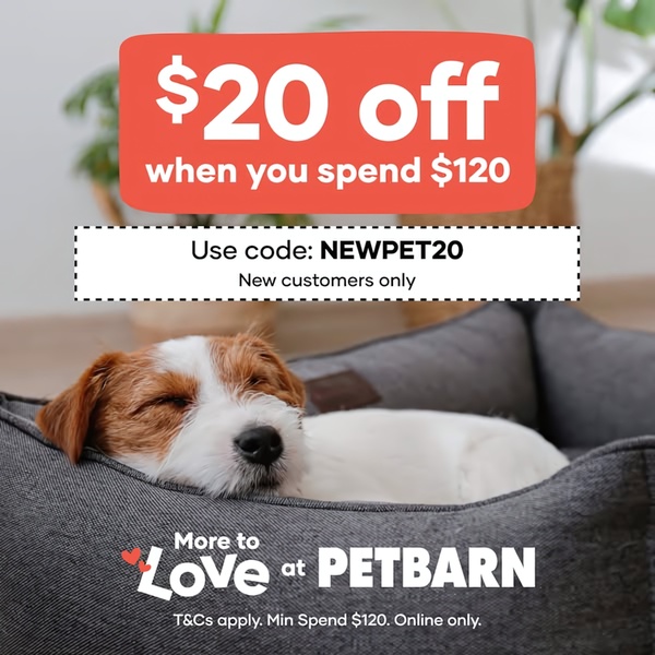



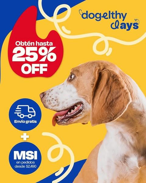










Promer helps you find the pattern, adapt it to your product, and create your own version in minutes.






