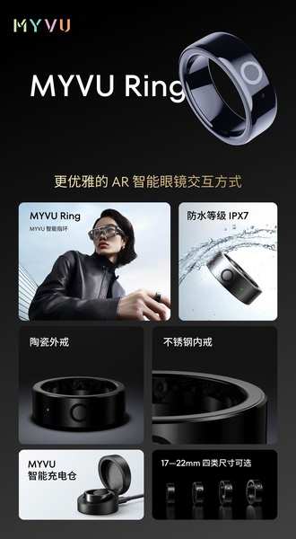
A high-contrast, multi-panel grid layout highlighting key product features like waterproof certification, material composition, and ergonomic sizing for a smart ring.
Free credits included. No card required
This smart ring ad creative effectively uses a multi-panel grid to communicate complex product value propositions in a single glance. By segmenting the screen, the brand creates a clear visual hierarchy that guides the viewer through critical product specs, ensuring every functional detail has its own designated space for maximum clarity. This approach works for most ecommerce teams because it reduces cognitive load, allowing the consumer to quickly absorb technical benefits like durability and sizing without feeling overwhelmed by a single, dense image. Leveraging tools like Promer AI allows you to deconstruct such high-performing modular structures to test your own product features in a similar high-conversion format.
Great product ads are built on a structured foundation that prioritizes clarity and visual information density over decorative noise.
Pro tip
When using a grid-style ad, ensure that your most vital hook—such as a pain-point solution—occupies the upper-most, central panel. Users typically scan top-to-bottom, so placing the most compelling feature in the first position of your grid maintains the highest attention span for your smart ring or similar technical gadget.






.png)
Promer helps you find the pattern, adapt it to your product, and create your own version in minutes.






