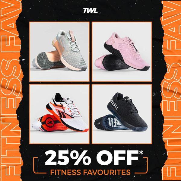
A clean, four-quadrant layout displaying various running shoe models against a high-contrast orange and black frame, emphasizing a 25% discount offer.
Free credits included. No card required
This running shoe ad creative utilizes a symmetrical grid layout to showcase product variety while keeping the primary discount offer as the visual focal point. The combination of a clean, minimalist 4-panel display with bold high-contrast colors creates an organized yet urgent shopping environment that reduces cognitive load for the viewer. This structured approach allows Promer AI users to replicate the effectiveness of multiple-product showcase ads without needing extensive creative design resources. By grouping several items together, the brand presents a broader catalog range, which typically helps increase the likelihood that a viewer will find at least one product that aligns with their personal aesthetic or functional needs.
Great ads start from a balanced visual structure that allows the product and the offer to share the spotlight equally.
Pro tip
When using a grid-style layout, ensure the lighting and angle of all four products are consistent to maintain a professional look. This uniformity prevents visual clutter and keeps the user focused on the discount rather than quality discrepancies.












.png)
Promer helps you find the pattern, adapt it to your product, and create your own version in minutes.






