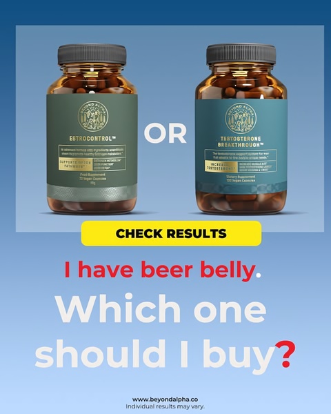
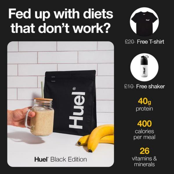
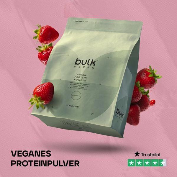
A split-view product comparison ad that uses a direct question hook to address customer pain points and drive product selection.
Free credits included. No card required
This dietary supplement ad creative leverages a classic binary choice to simplify the customer's decision-making process. By placing two distinct products side-by-side with a clear 'OR' separator, the brand forces the viewer to self-identify with a specific health goal, making the path to conversion feel like a personal recommendation rather than a generic pitch. This approach effectively reduces cognitive load by framing the advertisement as a diagnostic tool.
For most ecommerce teams selling multiple products, this pattern works because it qualifies the lead before they even click the CTA. By using Promer AI to analyze similar structures, you can ensure your product comparison remains visually balanced while highlighting the unique benefit of each SKU. Always keep the text minimal to prevent visual fatigue, especially when your layout relies on a clean, professional aesthetic.
Great ads start from a clear structure that helps the customer diagnose their own needs before asking them to make a purchase.
Pro tip
When using a binary choice hook, ensure the CTA remains benefit-oriented rather than feature-oriented. A button that reads 'Check Results' performs better than 'View Product' because it promises a solution to the customer's specific problem.











.png)
Promer helps you find the pattern, adapt it to your product, and create your own version in minutes.






