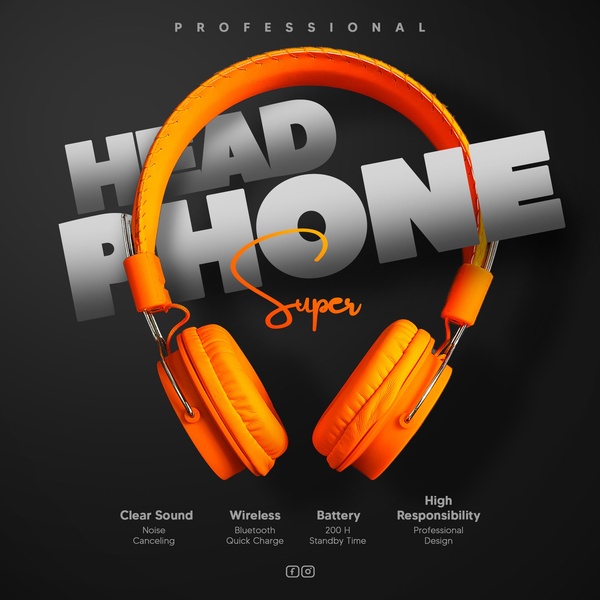
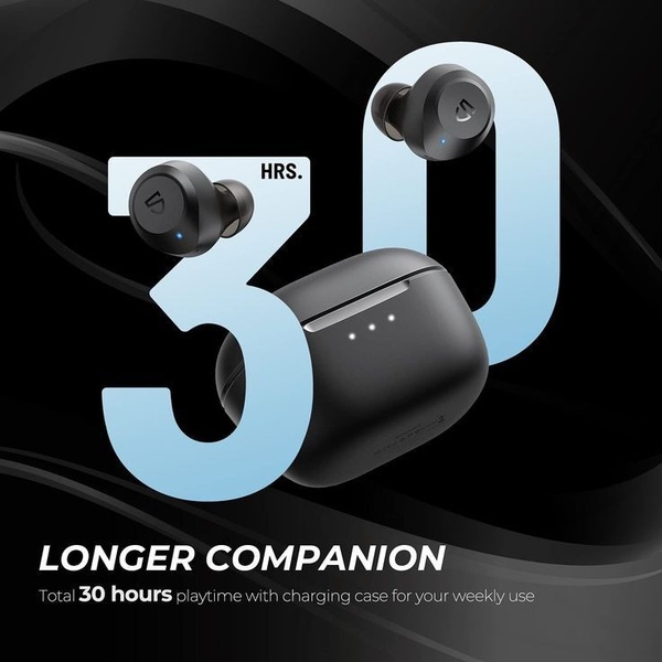
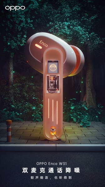
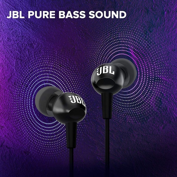
A high-impact product ad for wireless headphones featuring a bold orange color palette, clear feature callouts, and minimalist typography on a dark background.
Free credits included. No card required
This ad creative utilizes high-contrast color theory to make the wireless headphones the instant focal point against a dark, minimalist background. By isolating the product and pairing it with large, bold typography, the visual hierarchy immediately directs the user's attention to the product category before leading them to secondary benefit callouts. The use of a single, vibrant accent color against a monochromatic base is a proven strategy to stop the scroll in busy social feeds. Relying on Promer AI to maintain this level of visual consistency allows brands to highlight key technical specs without cluttering the aesthetic. Typically, this approach works best when your product silhouette is distinct and can benefit from a clean, high-end presentation that emphasizes professional utility over lifestyle context.
A winning ad is built on a structured hierarchy that gives the eye a natural path from product identification to feature consumption.
Pro tip
When using high-contrast color schemes, ensure your callout text is legible by maintaining a strict font hierarchy. If your product is a different color, consider using a brand-aligned accent shade that provides the same level of pop against your chosen background to maintain the 'professional' mood.


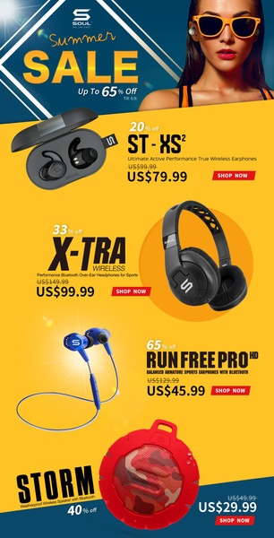
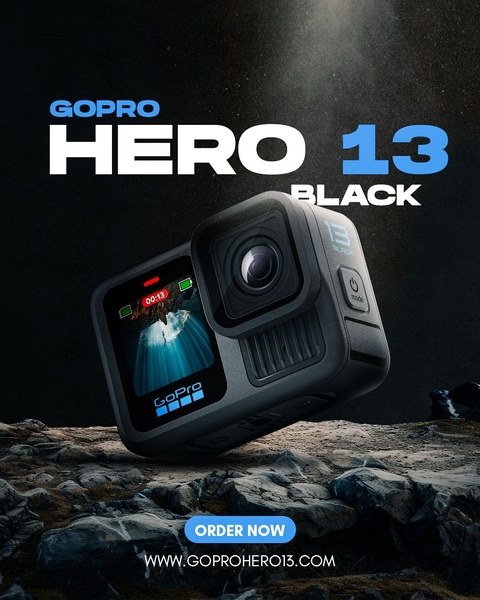



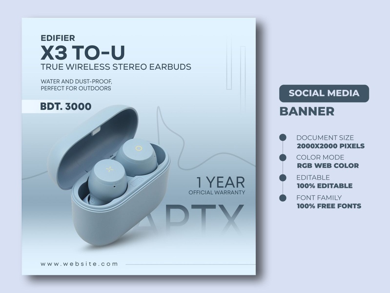






Promer helps you find the pattern, adapt it to your product, and create your own version in minutes.






