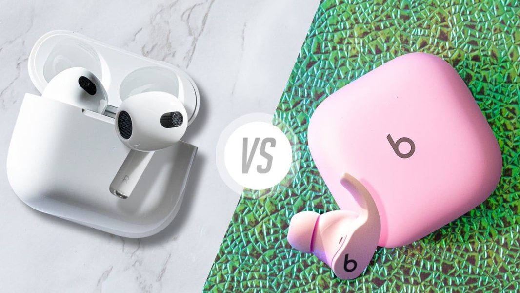
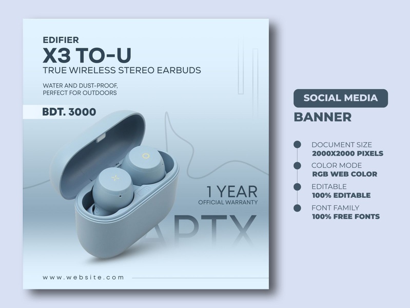
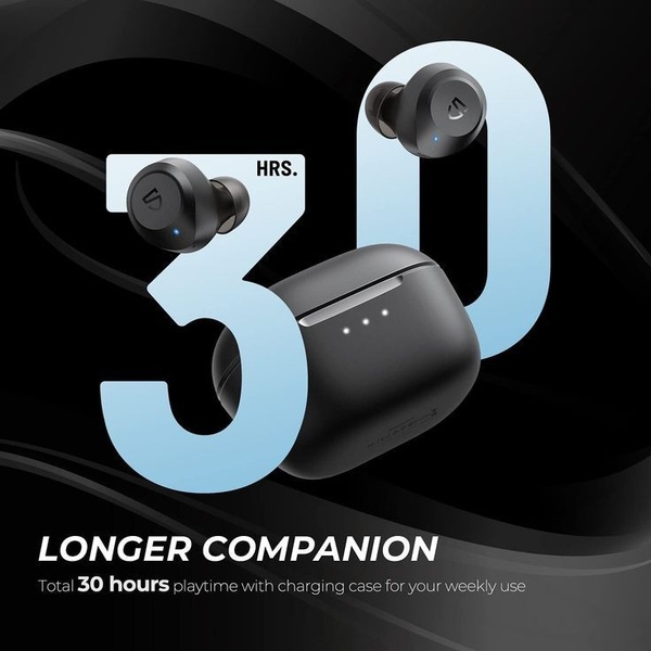
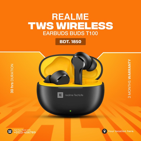
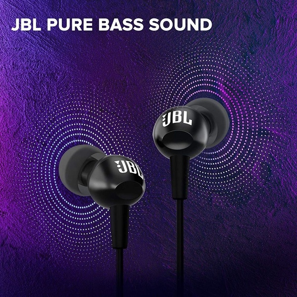
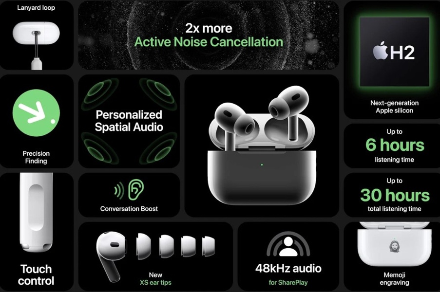
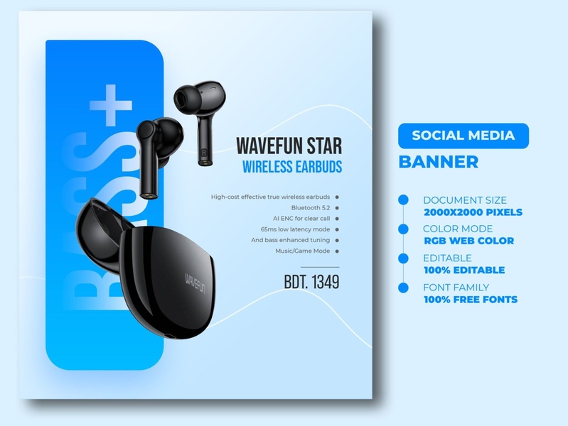
A high-contrast 16:9 comparison visual showing two different earbud sets on a split background to trigger an immediate us-vs-them psychological hook.
Free credits included. No card required
This comparison approach uses a minimalist split-screen layout to highlight the wireless earbuds against a competitor, instantly forcing a viewer to choose a side. The immediate cognitive friction between the two distinct color profiles creates an irresistible visual hook that stops the scroll.
For most ecommerce teams, this strategy works because it simplifies the decision-making process by presenting a direct alternative to the market incumbent. By using Promer AI to analyze the structure of this comparison, you can effectively position your product against established leaders in your space without relying on complex performance-ad mechanics.
Great ads start from a clear psychological structure like a comparison, not a blank design.
Pro tip
When using a comparison hook for your product, ensure the contrasting side features a design that is distinct enough to prevent color fatigue. Test one version with a neutral competitor side and another with a bold, high-contrast side to see which drives a higher click-through rate.










Promer helps you find the pattern, adapt it to your product, and create your own version in minutes.






