.png)
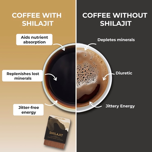
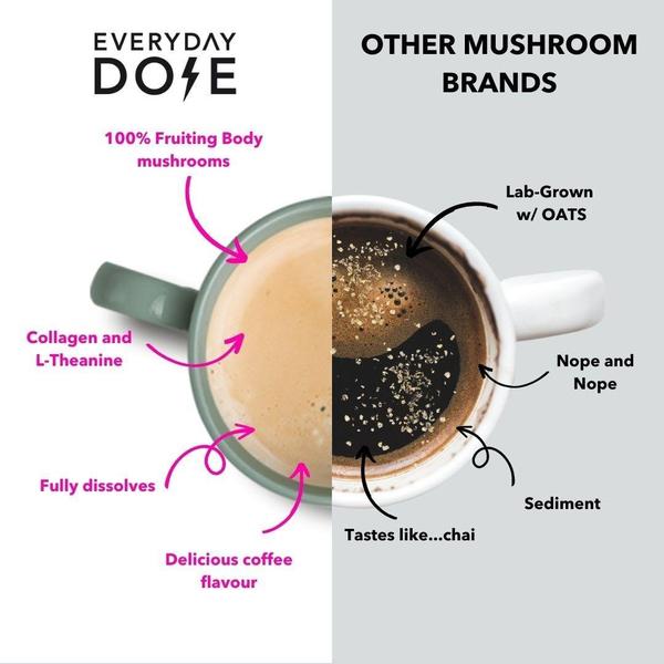
This vertical creative uses a split-screen design to highlight the benefits of a superfood latte against a traditional sugary alternative.
Free credits included. No card required
This superfood latte ad creative leverages a clean split-screen layout to visually distill the value proposition of the product. By using the Us vs Them comparison strategy, the brand immediately forces a binary choice in the consumer's mind: healthy, functional benefits versus the downsides of traditional, sugary alternatives. This framing removes cognitive friction by using simple checkmarks and X-marks to signal value.
Great ads start from an idea, a feeling, or a structure, not a blank design.
Pro tip
When building comparison ads, ensure your 'Them' column represents the generic, outdated alternative your audience already uses. Focusing on the 'cost per serving' or 'functional ingredient' aspect is typically more effective than generic price claims if your product is premium.

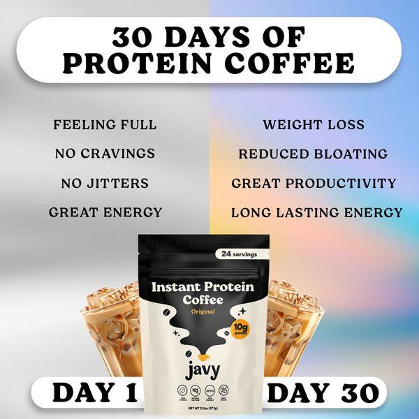
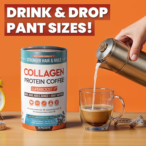
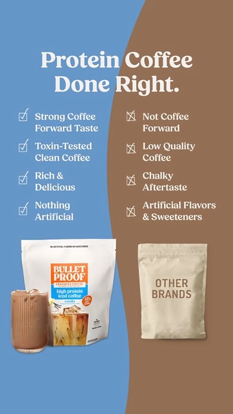
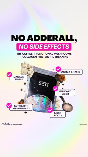
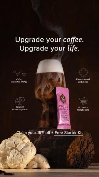

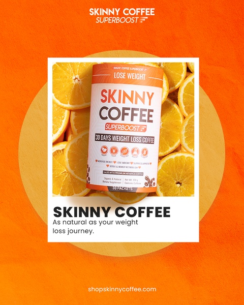
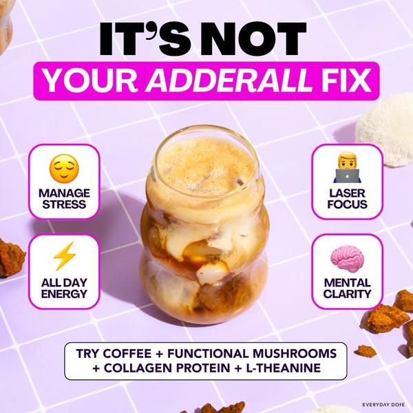

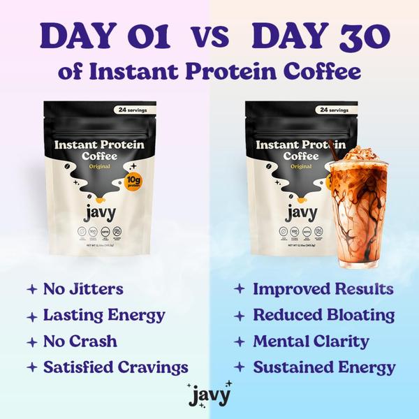


Promer helps you find the pattern, adapt it to your product, and create your own version in minutes.






