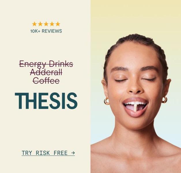
A clean, square-format ad featuring a user taking a pill, positioned against a list of common energy stimulants to contrast them with the featured product.
Free credits included. No card required
This nootropic supplement ad creative leverages a stark contrast between common high-stimulation habits and the brand's alternative to stop the scroll. By visually simplifying the competitive landscape and centering the user experience, the ad creates an immediate 'us vs them' narrative that resonates with audiences seeking focus without the typical side effects.
For most ecommerce teams, this pattern proves effective because it anchors the product in a familiar problem space before offering a singular solution. Using Promer AI, you can replicate this visual hierarchy and clean, product-focused layout for your own supplement lineup to ensure your value proposition remains front-and-center.
Great ads start from an idea, a feeling, or a structure, not a blank design.
Pro tip
When using a comparison list, ensure the final item in the list is your product. This visual sequencing naturally guides the user's eye from the 'problem' items down to your 'solution' CTA.

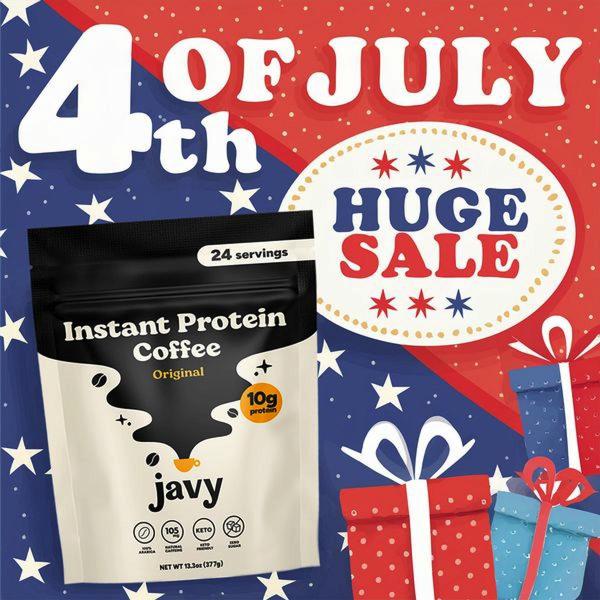
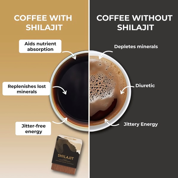
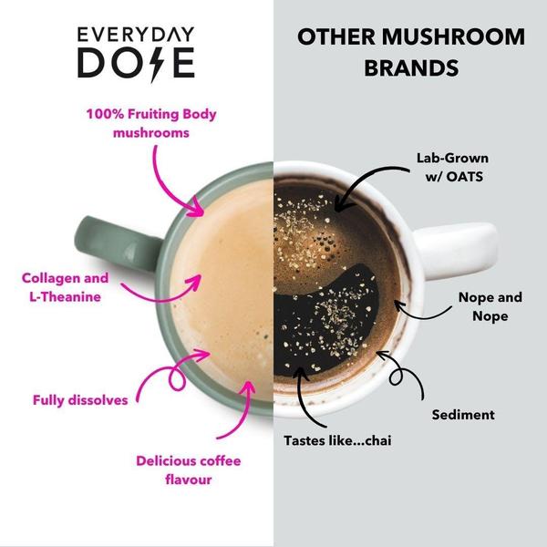
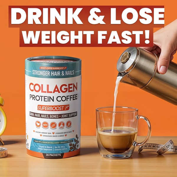
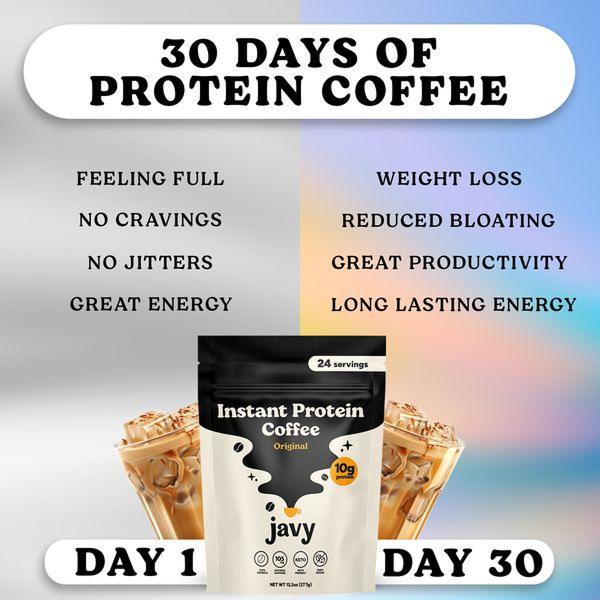
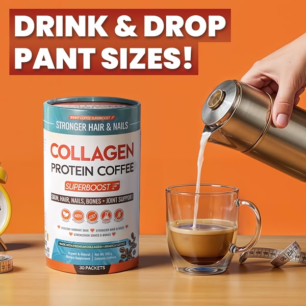
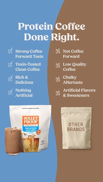
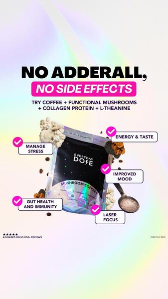
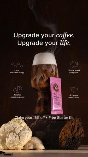

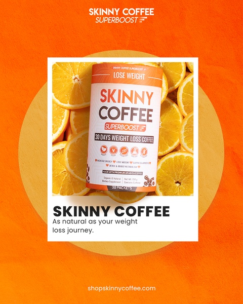
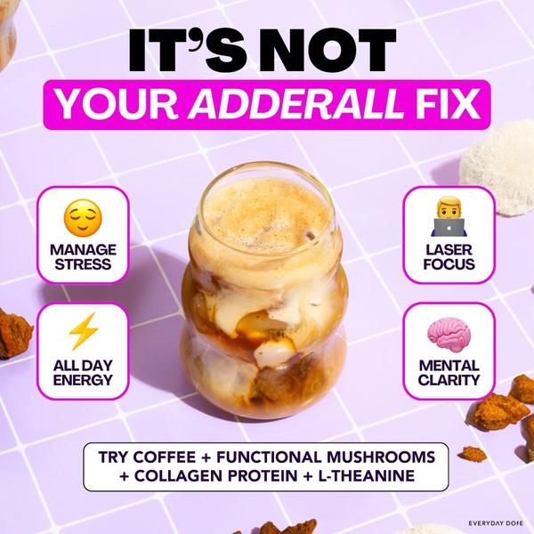
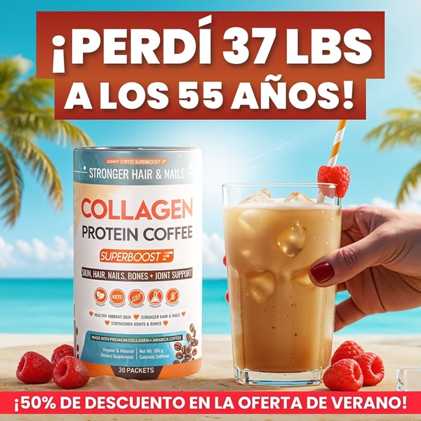
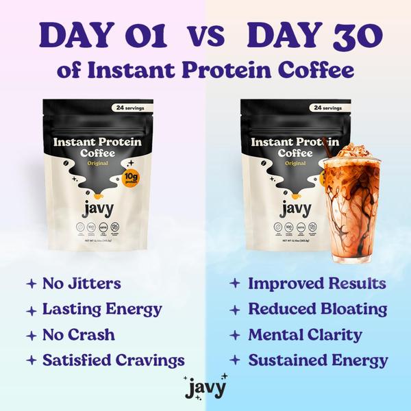
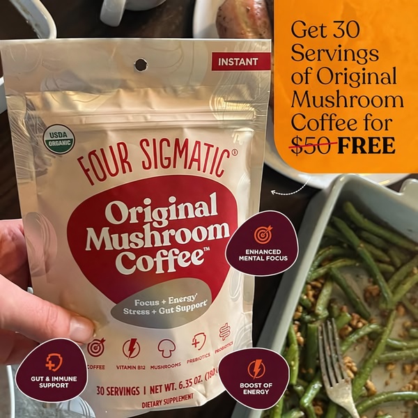
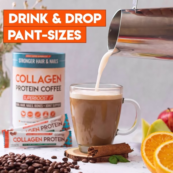
Promer helps you find the pattern, adapt it to your product, and create your own version in minutes.






