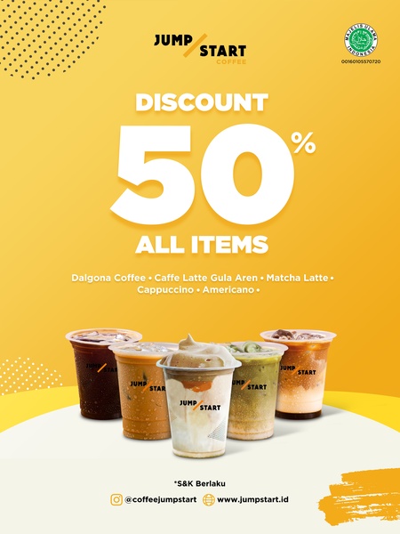
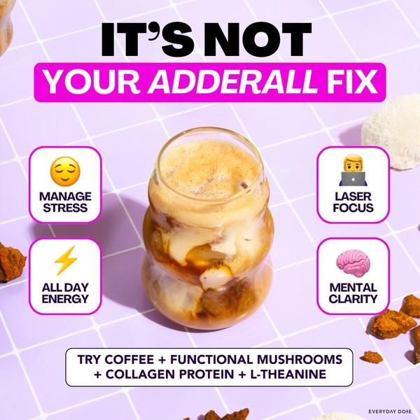
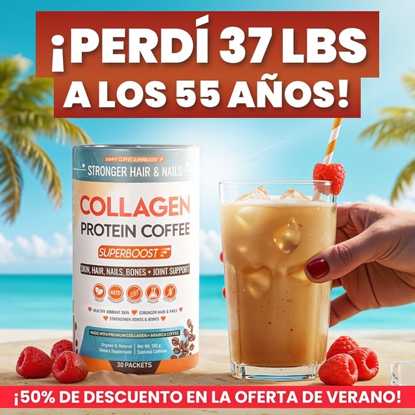
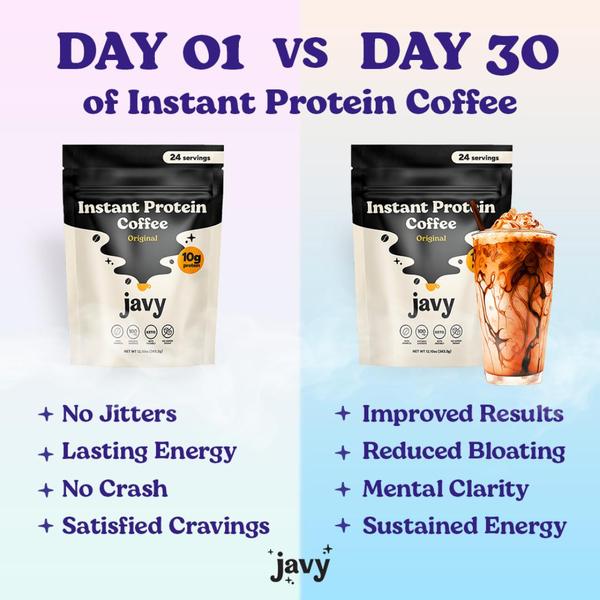
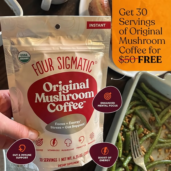
A 3:4 aspect ratio static ad for coffee drinks featuring a prominent 50% discount offer over a clean, yellow brand-colored background.
Free credits included. No card required
This coffee drink ad creative succeeds by leveraging a high-contrast yellow background that acts as a visual interruptor for mobile feeds. By placing a massive, bold '50%' directly in the center, the brand forces an immediate comprehension of the value proposition, which is crucial for quick-decision categories like beverages.
The primary driver of performance here is the reduction of cognitive load through a hyper-simplified layout that places the offer above the actual product shots. For most brands, this structure works because it anchors the viewer on the benefit before showing the product, a technique you can easily replicate within Promer AI to test different discount variations against your current creative assets.
A winning offer doesn't need complex design; it needs a visual hierarchy that makes the benefit impossible to ignore.
Pro tip
When running discount ads, pair your static 50% off visual with a secondary, scarcity-driven caption to improve conversion rates. Often, a 'limited time' or 'while supplies last' message creates the urgency needed to turn a passive scroller into a customer.

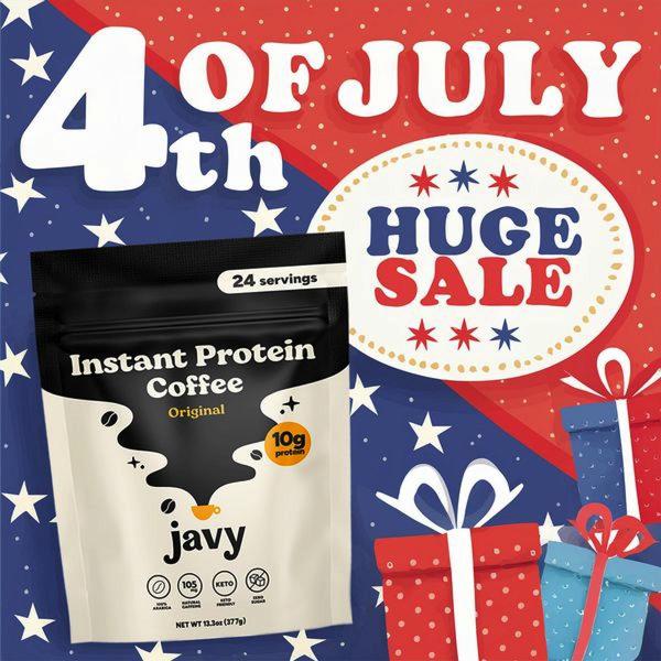
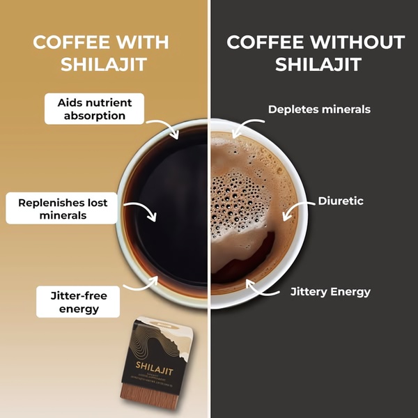
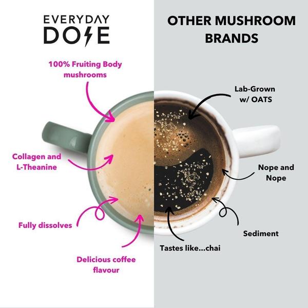
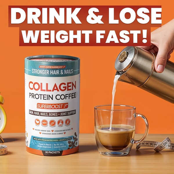
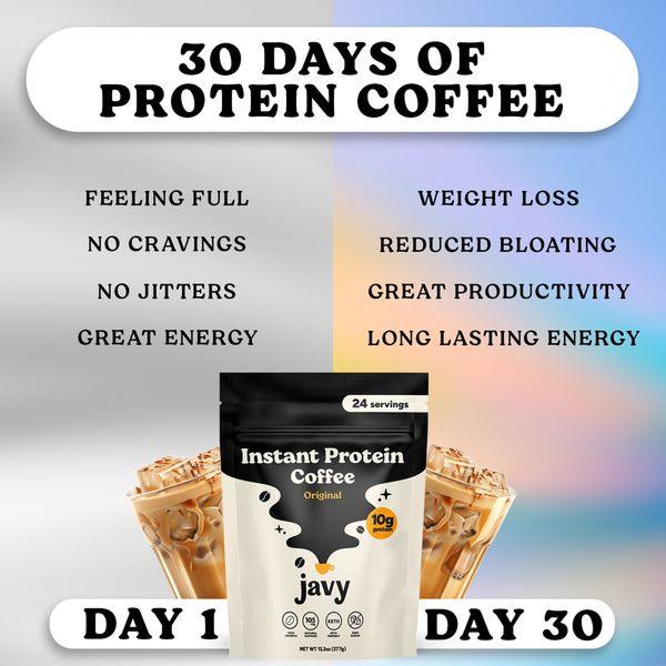
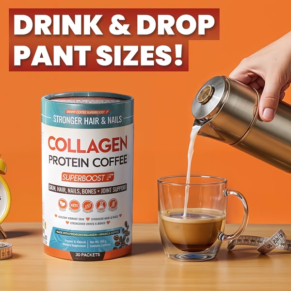
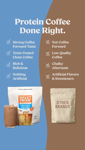
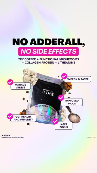
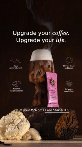
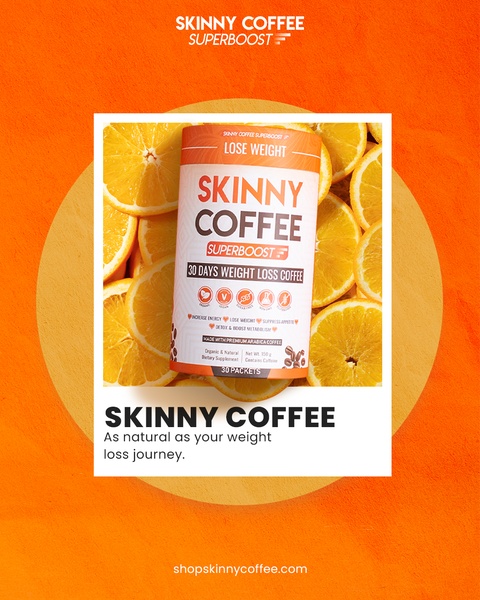
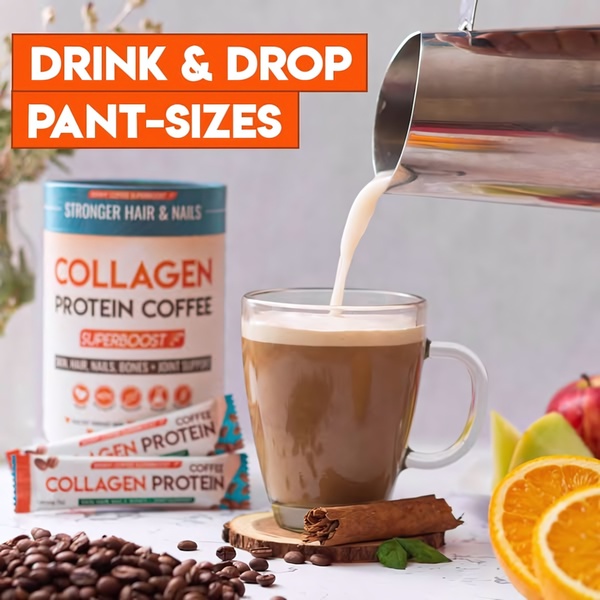
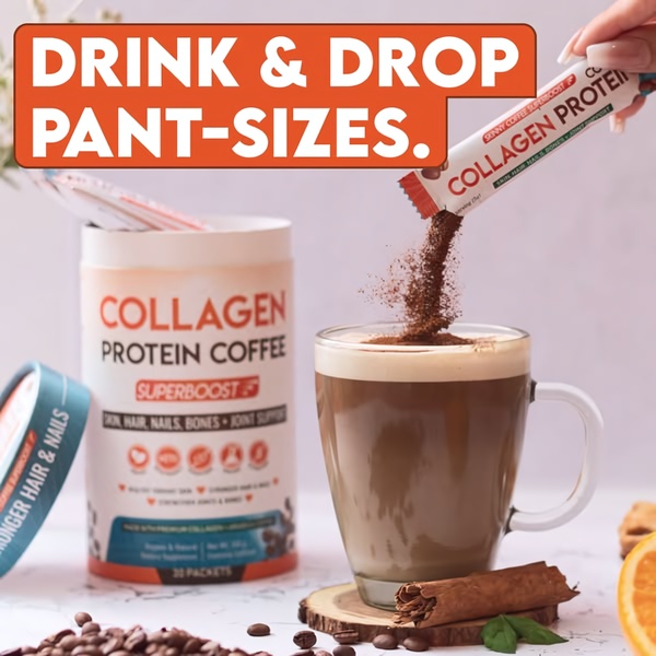
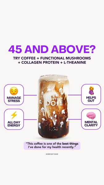
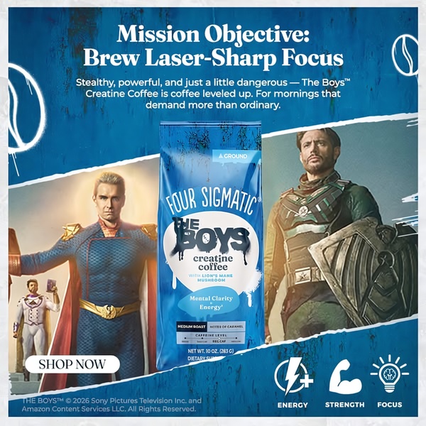
Promer helps you find the pattern, adapt it to your product, and create your own version in minutes.






