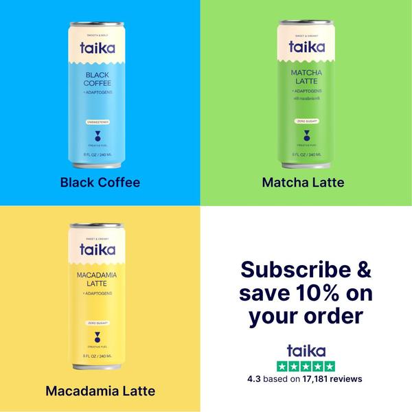
A clean 1:1 grid layout featuring three distinct beverage variants alongside a clear value proposition and social proof.
Free credits included. No card required
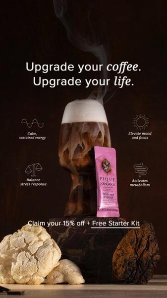
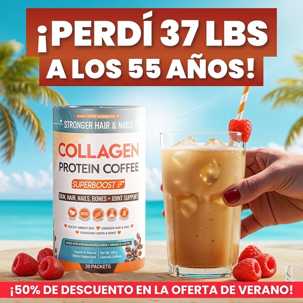
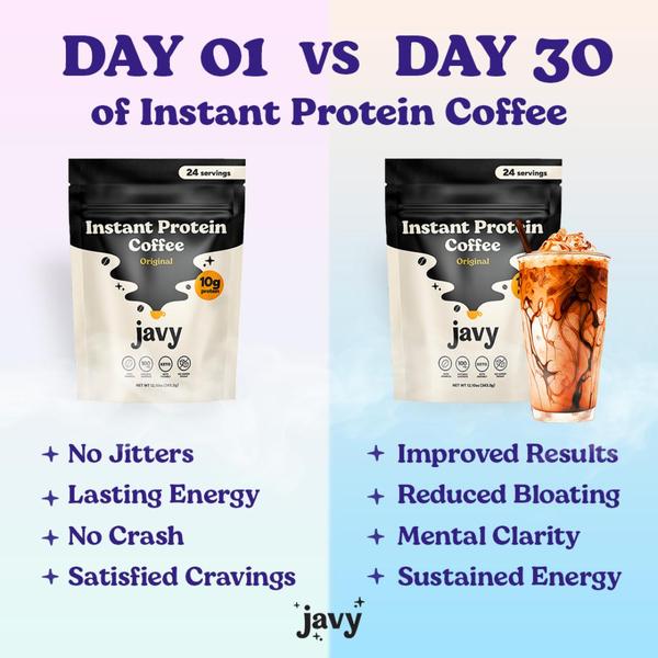
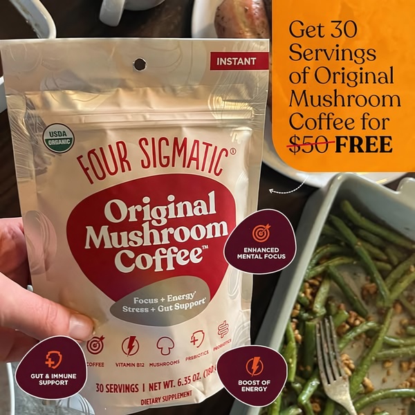
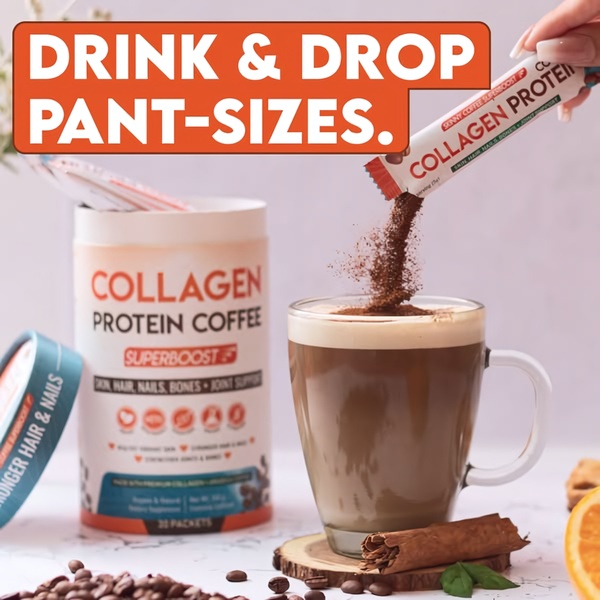
This adaptogen drink ad creative succeeds by using a high-contrast grid to eliminate decision fatigue while showcasing product variety. By dedicating a quadrant to each flavor and one to the offer, the brand creates a balanced, visually digestible layout that communicates product range and subscription incentives instantly. Leveraging a structured product grid helps customers quickly identify their preference while anchored by clear value-driven copy.
This pattern works effectively for most ecommerce beverage teams because it builds immediate brand familiarity and trust. By using Promer AI, you can replicate this organized, grid-based aesthetic for your own product line to clearly display multiple variants without cluttering the screen or overwhelming the viewer.
Great product ads act as a navigational map, guiding the user from flavor selection to conversion in a single, glanceable frame.
Pro tip
If your product line doesn't have multiple variants, try using the empty quadrants for lifestyle imagery or specific ingredient callouts. This maintains the clean, balanced grid layout while providing more depth into what makes your drink functional or unique.

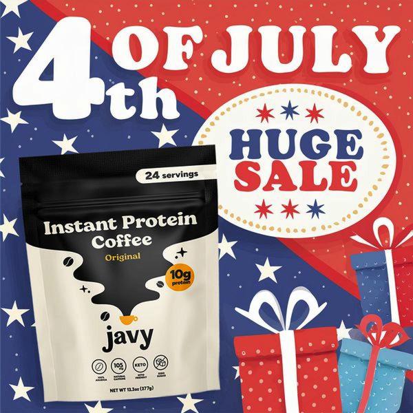
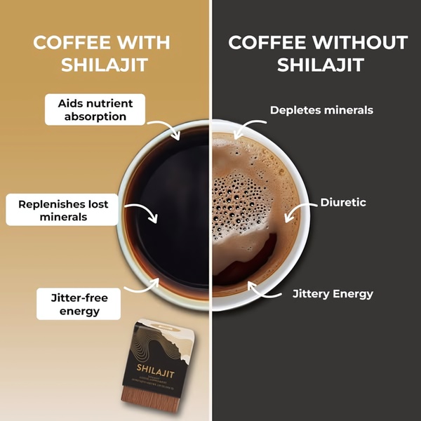
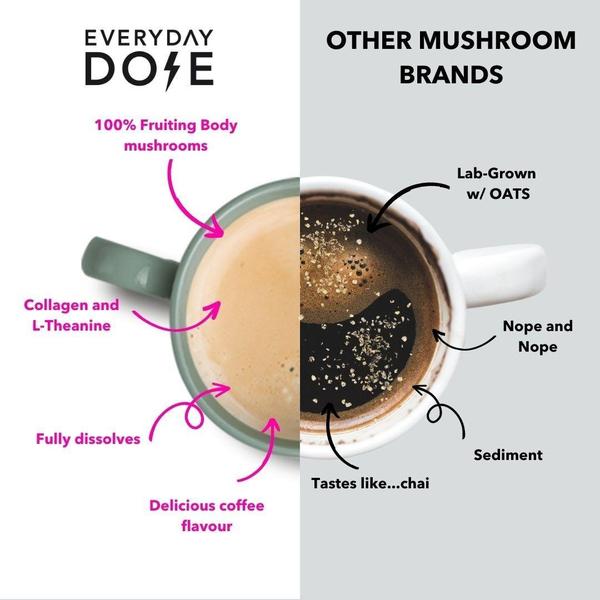

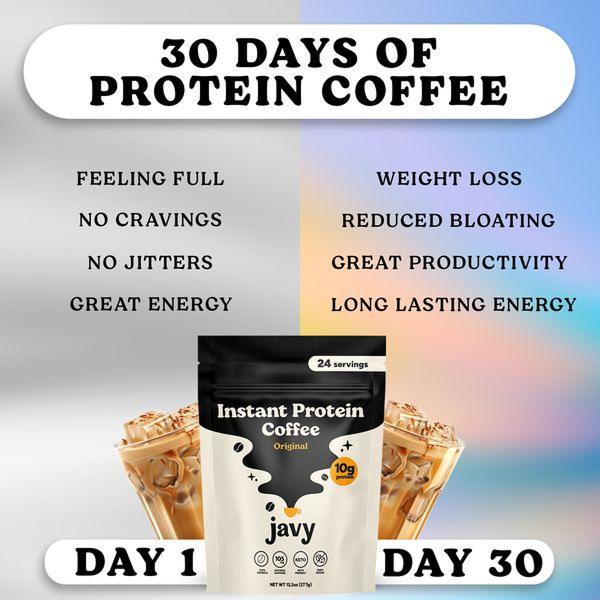
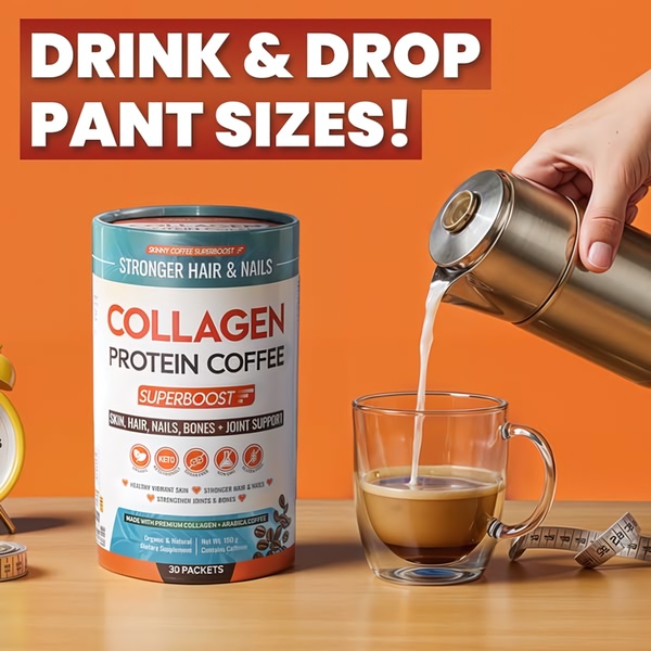
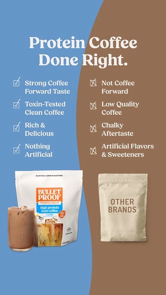
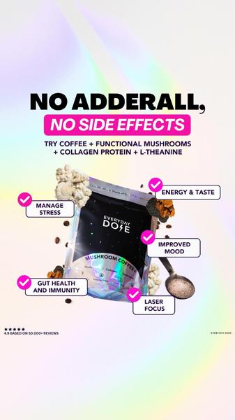

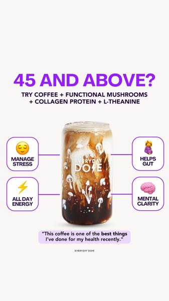
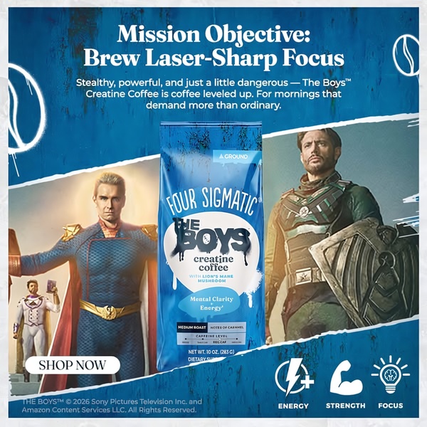
Promer helps you find the pattern, adapt it to your product, and create your own version in minutes.






