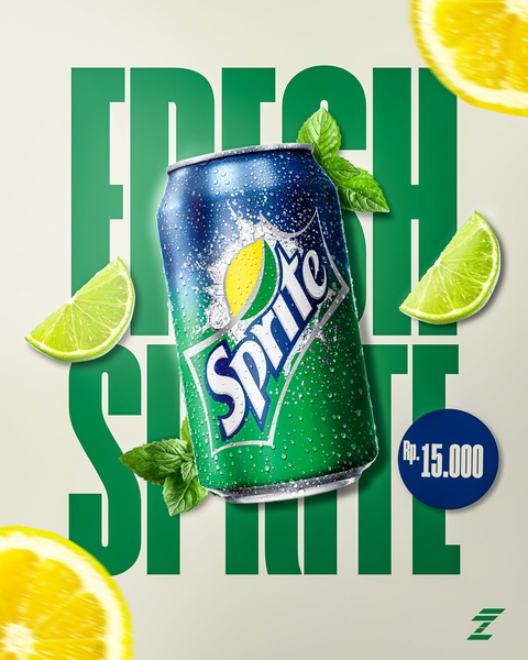
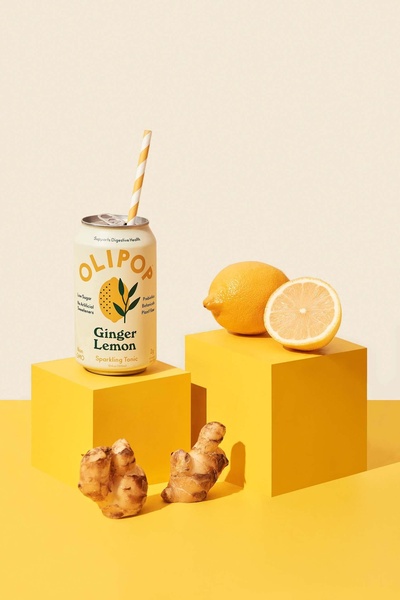
A high-refreshment visual featuring a soda can centered with lime and lemon accents on a light background, emphasizing product freshness.
Free credits included. No card required
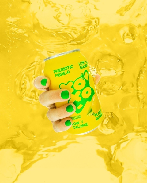
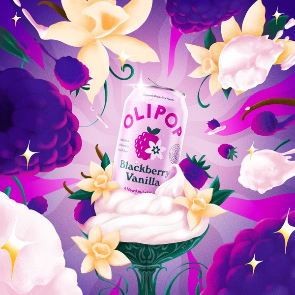
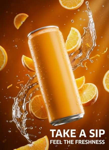
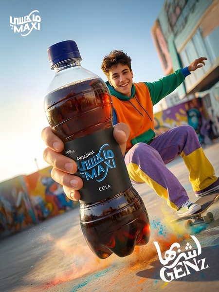
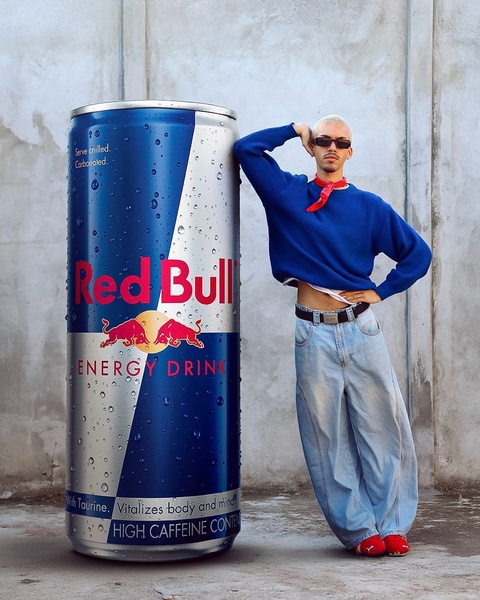
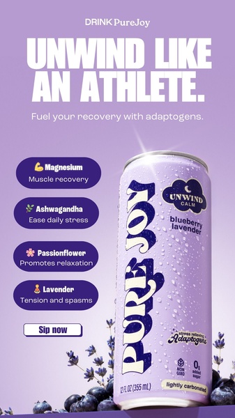
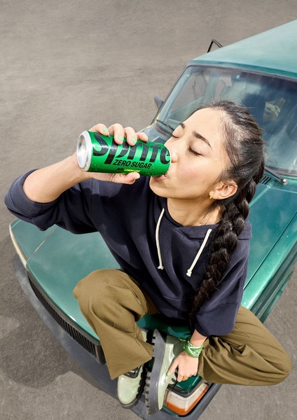
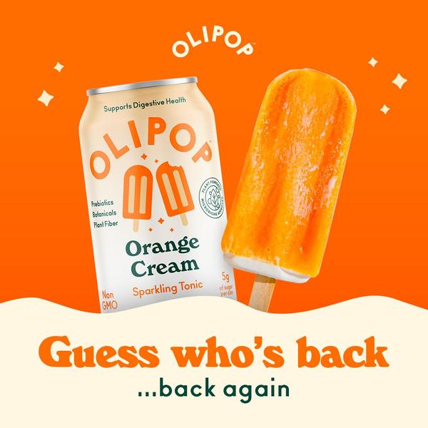
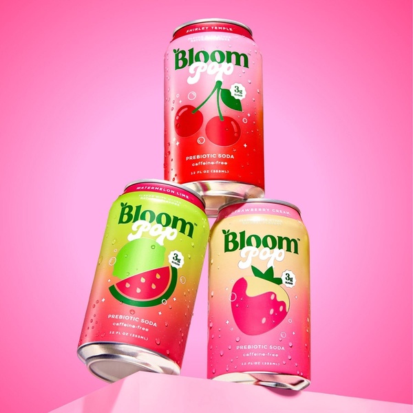
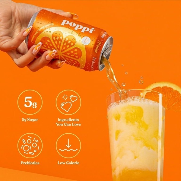
The soda can ad creative succeeds by leveraging high-contrast color psychology and a minimalist composition to evoke immediate thirst and freshness. The central strategy relies on the interplay between the cool tones of the product and the warm, vibrant citrus accents to draw the eye directly to the center of the frame. This visual hierarchy keeps the product as the undisputed hero, using condensation to signal temperature and quality. By stripping away complex backgrounds, the creative forces the viewer to focus on the immediate appeal of the item. For ecommerce teams, Promer AI provides the tools to replicate these hero-shot structures for any product category. This pattern is particularly effective because it relies on sensory cues rather than text-heavy messaging, which often leads to faster scroll-stopping performance in most cases.
Great ads start from an idea, a feeling, or a structure, not a blank design.
Pro tip
When focusing on sensory-driven visuals like this, ensure your lighting choice matches the product's intent—bright and cool for beverages, or warm and textured for snacks. Avoid cluttering the background; let your product’s natural color palette dictate the accent colors used for floating elements to maintain a premium feel.
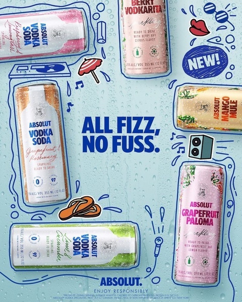
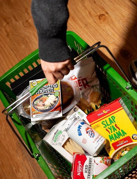
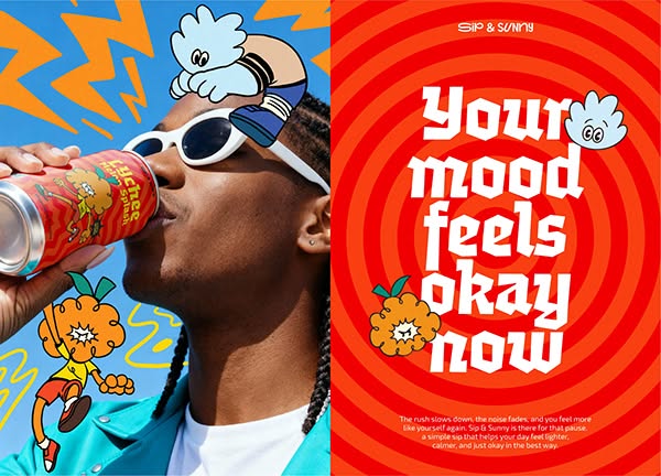


Promer helps you find the pattern, adapt it to your product, and create your own version in minutes.






