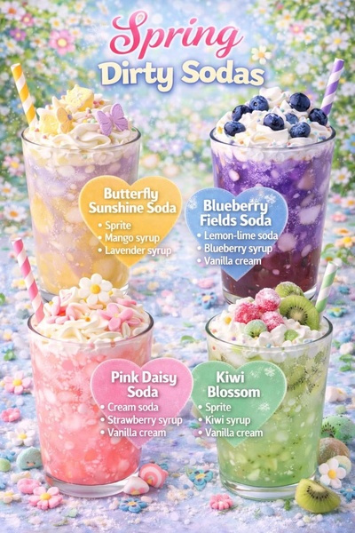
A high-resolution display showcasing four distinct specialty soda variations, each paired with a breakdown of its core ingredients on a floral background.
Free credits included. No card required
This Dirty Soda ad creative succeeds by leveraging a clear, organized menu-style layout that simplifies the selection process for the viewer. By anchoring the visual appeal of seasonal beverages with direct ingredient lists, the creative reduces cognitive load and accelerates purchase intent. The use of distinct color-coded heart shapes to house the drink names and recipes creates a highly readable hierarchy that works well for social platforms where users scroll quickly.
This approach works because it transforms a standard product showcase into a helpful, snackable content piece that feels like a seasonal offer. Using Promer AI allows teams to replicate this structured, multi-product layout for their own categories. It is important to note that performance typically depends on how closely your visual theme aligns with current seasonal trends and your target audience's aesthetic preferences.
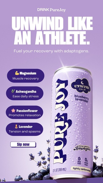
Great ads rely on an organized visual structure that makes the product's value proposition immediately legible to the customer.
Pro tip
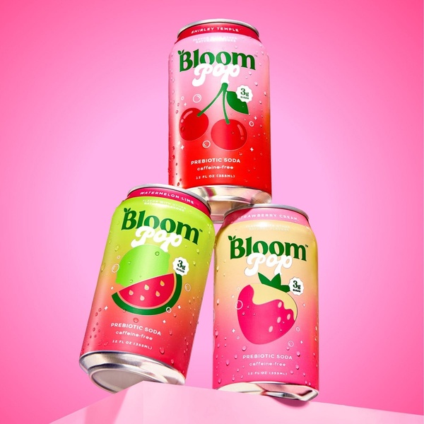
When showcasing multiple products in one frame, ensure that the visual weight of each item is balanced as seen in this 2:3 ratio layout. If one product is a bestseller, position it in the top left or center to capture the viewer's eye first during their initial scan.
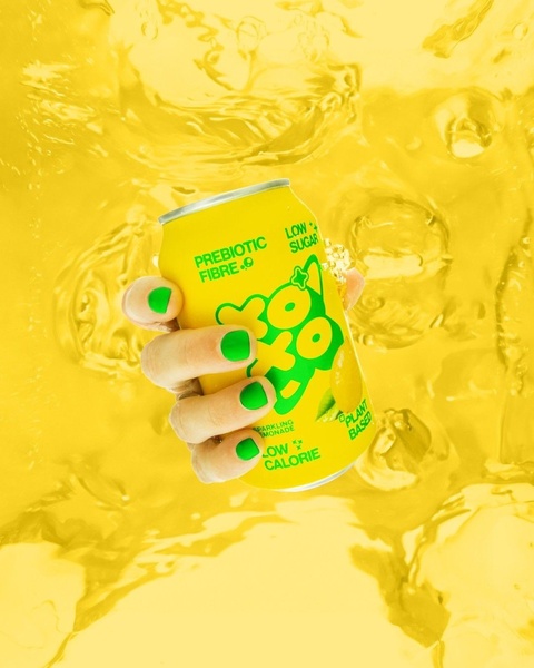
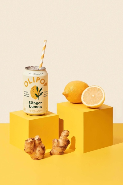
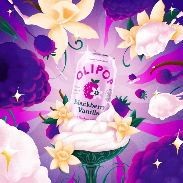

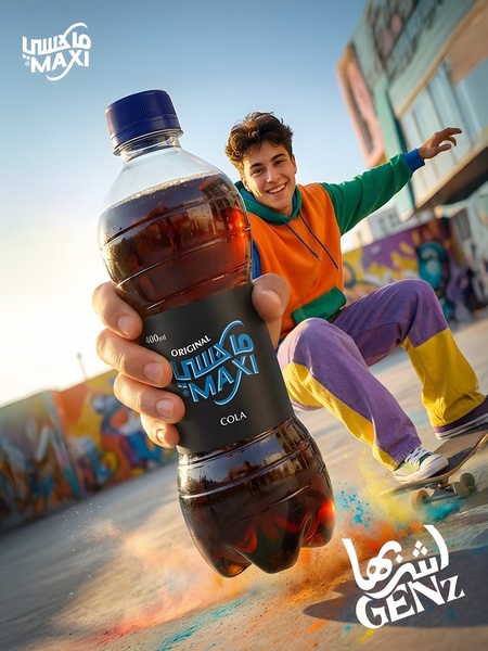



Promer helps you find the pattern, adapt it to your product, and create your own version in minutes.






