
A high-contrast visual comparison showing a chaotic mess of cables labeled Knotty next to an orderly organized tray labeled Nice.
Free credits included. No card required
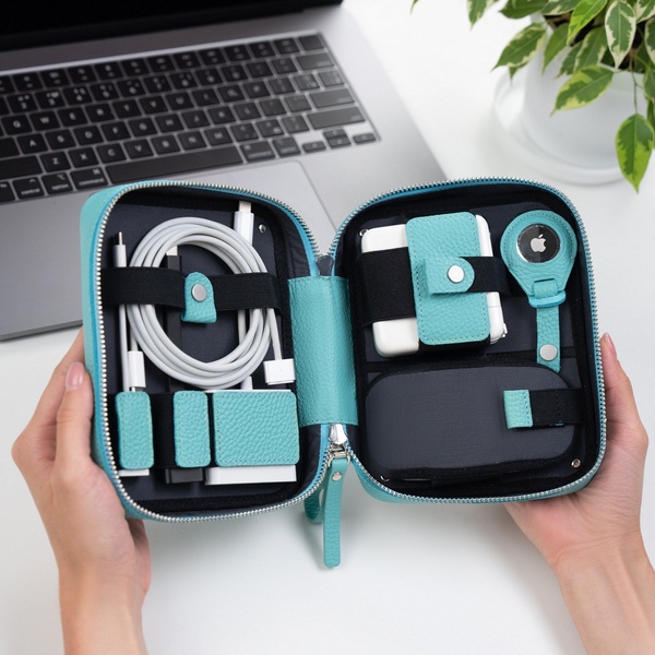
This organizer case ad creative utilizes a powerful side-by-side contrast to instantly visualize the value proposition. By juxtaposing a hand-drawn representation of cable clutter against a high-fidelity photo of a tidy interior, the ad forces the viewer to self-identify with the pain of disorganization while clearly presenting the solution. This approach works because it removes the cognitive load of reading long-form copy by using a universally recognizable before-and-after dynamic. This visual storytelling pattern is highly effective for accessories, as it highlights functional utility without requiring complex explanations. When using Promer AI to iterate on this strategy, marketers can maintain the minimalist aesthetic while testing different product orientations to see which internal configuration best drives consumer interest for their specific category.
Great ads start from an idea, a feeling, or a structure, not a blank design.
Pro tip
To maximize impact, ensure your product photo on the 'Nice' side is captured in a top-down, flat-lay style to mirror the symmetry of the messy side. This visual balance creates a sense of harmony that makes the product's value feel more tangible and attainable for the customer.











Promer helps you find the pattern, adapt it to your product, and create your own version in minutes.






