



What Does a Lipstick Ad Have to Show Before Anyone Tries the Shade?
A lipstick ad has to prove the color and the finish, because the shopper cannot test either one through a screen. The shade, the texture and the staying power are the three things people ask about, so the strongest creatives in this library answer one of them in the first second.
The texture question is the most common. Several ads go macro on a smear of lip tint, a gloss applicator or a matte bullet, and fill the frame with the finish instead of the packaging. The shade question gets answered with swatches, a labeled grid or a model whose lips match the tube, so the buyer sees the color on a real surface.
Claims take a different route. One ad splits the frame into dry lips and glossy lips, and another prints a "kissproof" line with water-proof and 24-hour badges beside a swatch. Others skip claims and sell the mood: dramatic shadow, a monochrome set on pedestals, or a flat lay framed by flowers. Each one picks a single job for the image instead of trying to do all three at once.
Top Creative Lipstick Ads to Learn From
Here are 9 lipstick advertising examples from the library, including lip tint and gloss formats, starting with texture close-ups and ending with before-and-after and claim-led layouts. Each one shows what the ad does and what you can borrow.
Example 1: "Glossy" Lip Tint Macro (Bold Claim, 9:16)
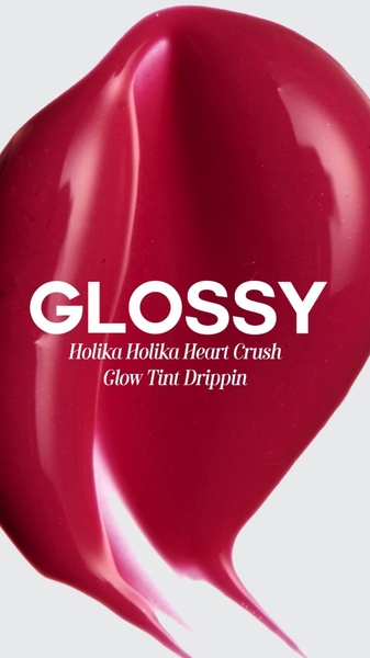
A tight macro shot of a deep pink lip tint smear fills a clean off-white background. A single bold word, "GLOSSY," sits in the center, so the finish is stated in one word and shown in the image at the same time.
Borrow: one word, one shade and one texture, with a neutral background so the product color is the only thing with weight.
Example 2: Lip Gloss Application Close-Up (Product Hero, 4:5)
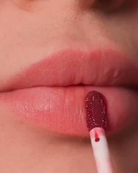
An extreme close-up shows an applicator laying a deep, high-shine gloss across the lips in pink, deep red and nude tones. There is no headline and no packaging, only the gloss and the light on it.
Borrow: show the product being applied rather than sitting still, and light it so the highlights make the texture look wet and full.
Example 3: Matte Lipsticks on Pedestals (Product Hero, 3:4)
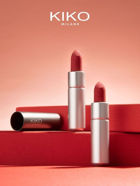
Two matte lipsticks stand on geometric pedestals in a monochrome red-orange scene, with silver accents on the packaging. The background matches the shade, so the matte surface and the shape of the bullet are what the eye finds.
Borrow: a background in the same hue as the product, with pedestals for height, when the finish is the selling point.
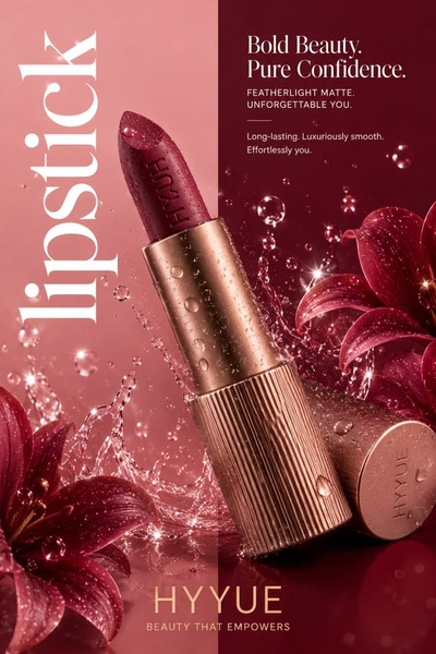
Example 4: Luxury Lipstick in Dramatic Light (Product Hero, 4:5)
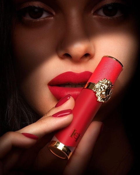
A model holds a branded lipstick close to her face, with her lip color matching the product. Hard side lighting leaves most of the frame in shadow, and red, gold and black give it a luxury tone.
Borrow: match the lips to the lipstick, and use one strong light source instead of even studio light.
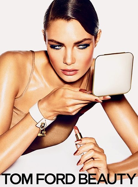
Example 5: Lipstick Held to the Eye (Product Hero, 4:5)
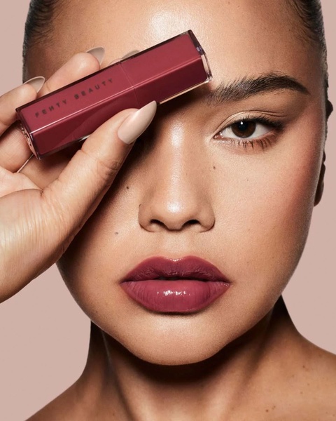
A clean studio portrait shows a model holding a lipstick next to her eye, in mauve and neutral beige. The unusual placement frames the face, and the brand name and shade on the tube stay readable without a headline.
Borrow: a small surprise in how the product is held, with the label turned toward the camera and no text on top.
Example 6: Lipstick Flat Lay With Flowers (Product Hero, 9:16)
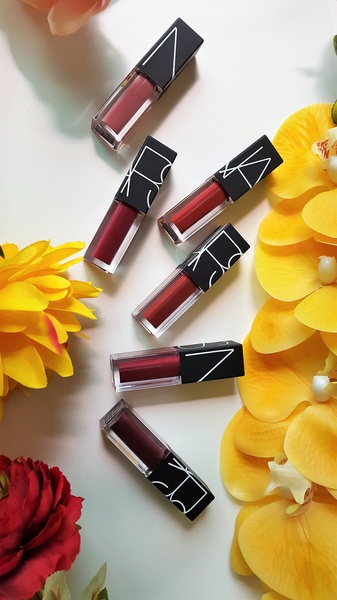
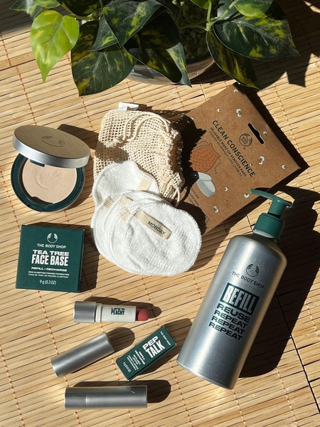
Six lipsticks lie flat on a white backdrop, framed by yellow and red flowers. The top-down view shows the whole line at once, and the white space makes the packaging and the petals stand out.
Borrow: a flat lay for a range, with a natural prop whose color picks up one of the shades.
Example 7: Six-Shade Lip Tint Swatch Grid (Feature & Benefit, 9:16)
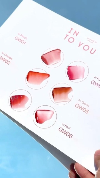
Six lip tint swatches sit in an organized grid on a soft blue background, each labeled with a shade name such as "In Peach" and "In Red." The labels remove the guesswork, so a shopper can point at a shade before opening the store.
Borrow: name every shade on the image, and keep the lighting identical across swatches so the colors compare fairly.
Example 8: Dry vs. Hydrated Lips Before & After (Before & After, 1:1)
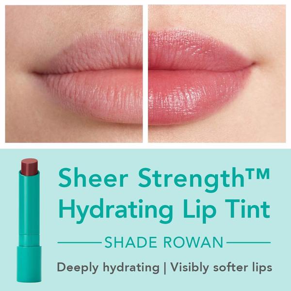
A vertical line splits the square into dry, textured lips and hydrated, glossy lips. The headline "Sheer Strength" sits with the product name, and a teal palette ties the packaging to the type.
Borrow: keep the lighting identical on both halves, and use real photos so the comparison earns trust.
Example 9: Kissproof Benefits With a Swatch (Feature & Benefit, 1:1)
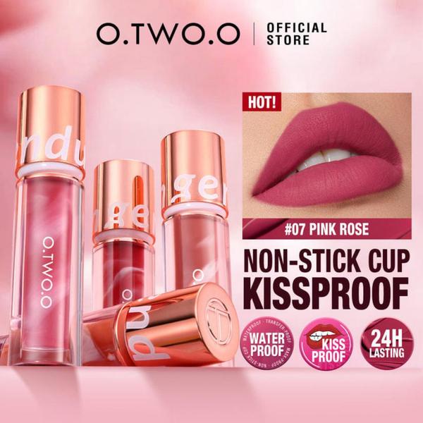
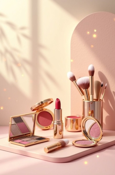
Several lip products stand on a soft pink backdrop with rose gold accents. A swatch image shows the color, and short badges name the claims: non-stick, kissproof, water-proof and 24-hour wear.
Borrow: turn each objection into one icon-sized badge, and pair the claims with a swatch as proof.
Lipstick Advertisement Ideas to Borrow From These Examples
- Fill the frame with the finish - a smear, a gloss pull or a matte bullet tells the texture without a caption (Examples 1, 2 and 3).
- Match the lips to the tube - color harmony makes the shade look like the point of the ad (Examples 4 and 5).
- Name every shade - labels and equal lighting turn a grid into a decision tool (Examples 6 and 7).
- Use one strong light - shadow does the work of a luxury headline (Example 4).
- Prove the change - a split frame beats a sentence about hydration (Example 8).
- Turn objections into badges - kissproof, water-proof and 24-hour fit in a single row (Example 9).
- Keep text to a word or none - several of the strongest ads use one word or no copy at all (Examples 1 to 5).
How Does Promer AI Turn a Lipstick Product Page Into Ad Creatives?
Most beauty brands have shade photos and a product page with finish, ingredients and claims. What is missing is the macro, the layout and the headline around them. Promer AI fills that gap, and you can create your first ad free, no credit card required.
AI Ad Clone is the closest match to this page. Pick a reference from the library - the swatch grid, the split before-and-after or the pedestal hero - and Promer AI rebuilds its structure around your product, with a headline, body and CTA suggested and each one editable. Your logo, colors and fonts come in through your Brand Kit.
To find the angle first, AI Ad Concept reads your product page and returns product highlights, ideal customer, pain point and need, then builds concepts from them. For lip products, that pain point is often smudging, dryness or shade fit, which the examples above answer with badges, macros and swatches. AI Photoshoot turns the photos you already have into studio-quality images for the hero shot.
Ratios cover 1:1 and 4:5 for Meta feeds, 9:16 for Stories, Reels and TikTok, and 16:9 and 1.91:1 for YouTube and Google Display. Promer AI creates the creative, while campaign setup and bidding stay in your ad platform.
Review everything before it publishes. AI-generated creatives can have mistakes, and in beauty the costly ones are shade accuracy, finish and any text on the image. Make sure claims such as kissproof or 24-hour wear are true for your product, any before-and-after matches a real result, and third-party logos in a reference are replaced with your own.





