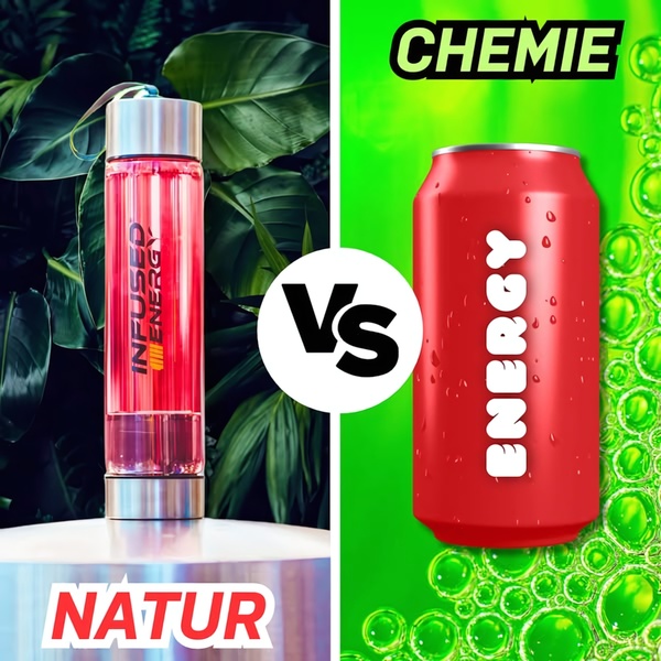
A side-by-side comparison creative featuring an organic, plant-infused energy bottle against a neon-colored chemical energy drink can.
Free credits included. No card required
This energy bottle ad creative leverages a stark visual split to instantly communicate product value through immediate comparison. By anchoring the natural energy bottle against a generic chemical alternative, the visual hierarchy forces the viewer to choose between opposing lifestyle identities within a single glance.
Great ads start from a clear structure that forces a decision from the viewer within seconds of the first impression.
Pro tip
When using a split-screen layout, ensure the typography for the 'natural' side feels premium while the 'competitor' side remains intentionally generic. This perceived difference in quality reinforces your brand authority without requiring long-form copy.


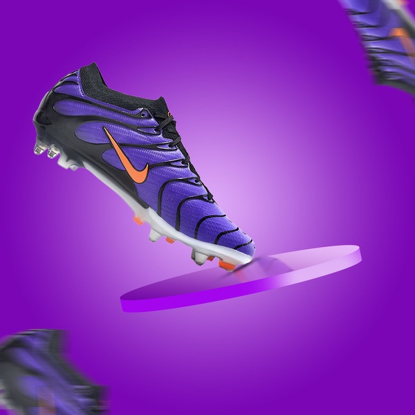


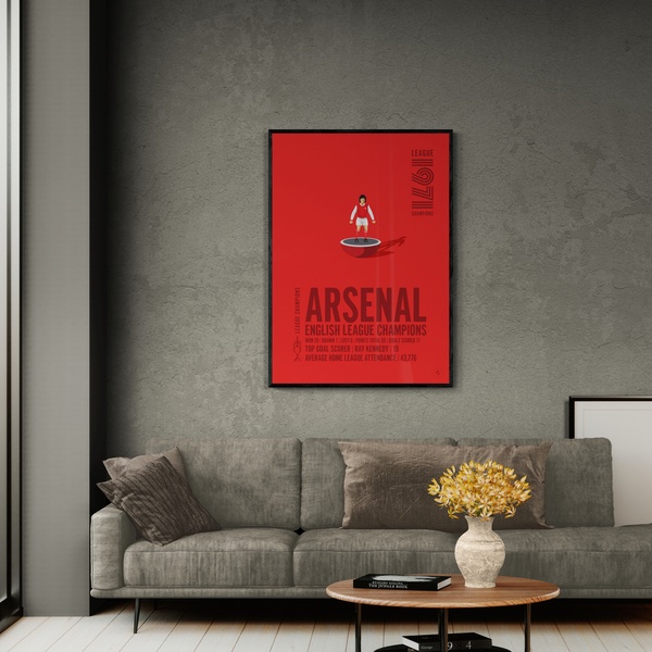

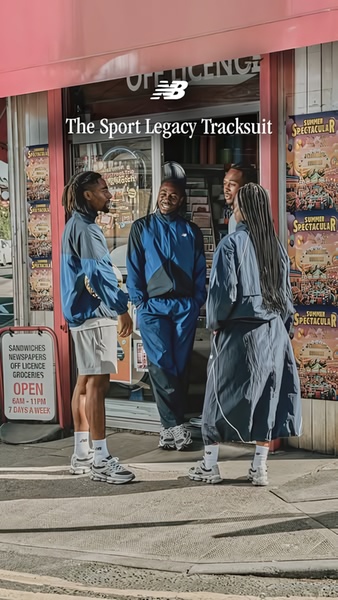



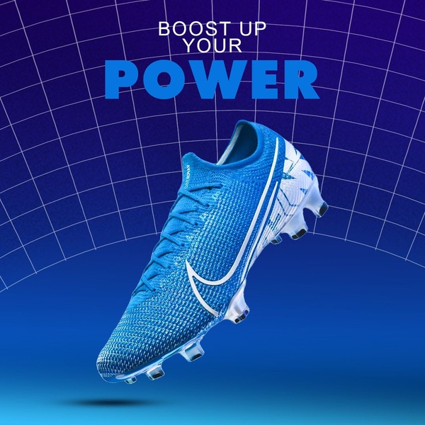
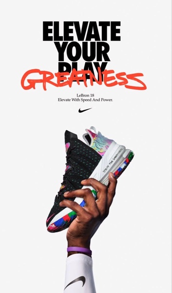
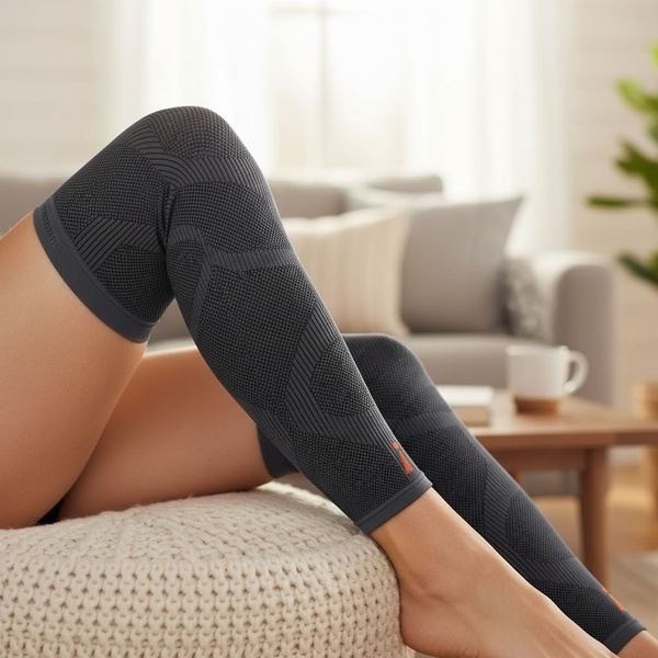
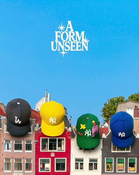



Promer helps you find the pattern, adapt it to your product, and create your own version in minutes.






