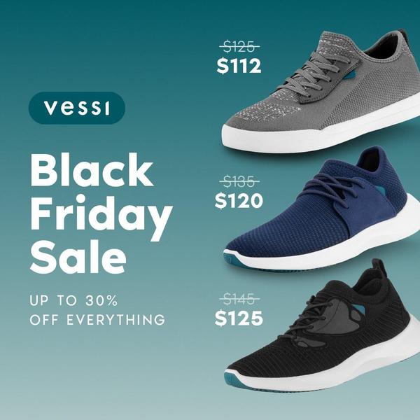
A clean, color-blocked 1:1 square ad showcasing three different shoe models with clear original and sale price comparisons.
Free credits included. No card required
This running shoe ad creative utilizes a disciplined grid layout and clear visual hierarchy to communicate a sale offer instantly. The strategy relies on a clean, price-led hook that removes friction for the customer by highlighting the specific discount for each product variant.
By keeping the design aesthetic minimal, the ad ensures the price-drop messaging remains the focal point for the user. Using Promer AI to replicate this structure allows performance marketers to maintain brand consistency while testing different sale value propositions across various product lines.
A sale ad that organizes its information clearly for the user is far more likely to stop the scroll than a cluttered promotion.
Pro tip
When testing a grid-based sale ad, try swapping the order of the products to see if putting your highest-ticket item at the top vs the bottom changes the click-through rate. Use this visual consistency to highlight new arrivals alongside best-sellers to drive traffic to multiple product pages simultaneously.




















Promer helps you find the pattern, adapt it to your product, and create your own version in minutes.






