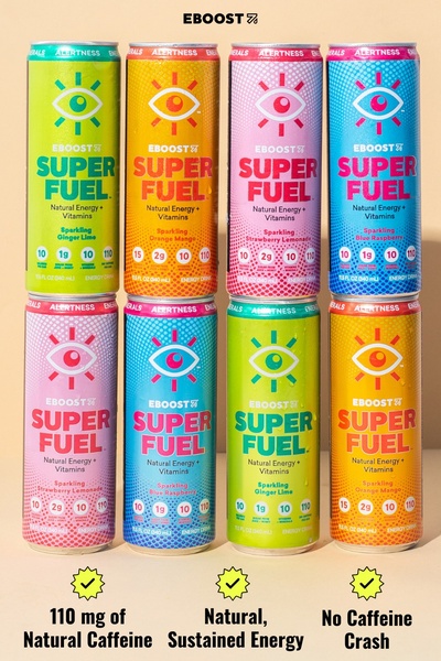
A vibrant 2:3 ratio grid display of EBOOST Super Fuel cans showcasing core product benefits via clear iconography and benefit bullets.
Free credits included. No card required
This energy drink ad creative utilizes a highly organized, grid-based visual strategy to showcase brand variety while keeping the value proposition front and center. By leveraging a clean, product-first display combined with simplified benefit icons, the creative immediately communicates the core message without overwhelming the viewer.
This pattern is effective because it reduces cognitive load for the consumer, allowing them to instantly associate the bold, colorful cans with functional benefits like 'natural caffeine' and 'no crash'. Teams looking to achieve a similar clarity in their own assets can use Promer AI to maintain this structured, benefit-focused approach across their own product catalog.
A winning creative structure shouldn't just look good; it must act as a visual shortcut to your customer's primary pain point.
Pro tip
When using a grid-based product ad, always test a variation where you isolate a single best-selling flavor instead of showing the entire range. This helps determine if variety confuses the user or acts as an social proof engine for your brand.

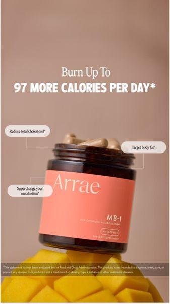

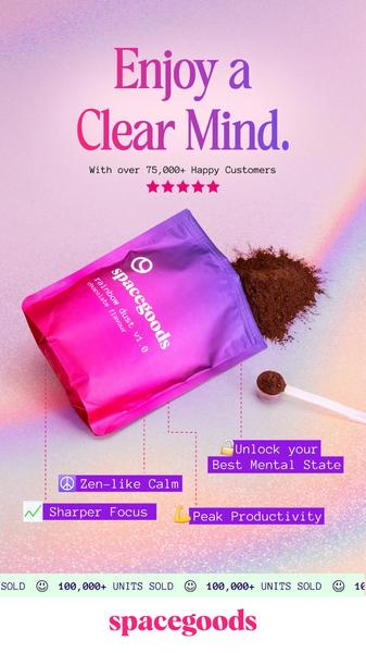

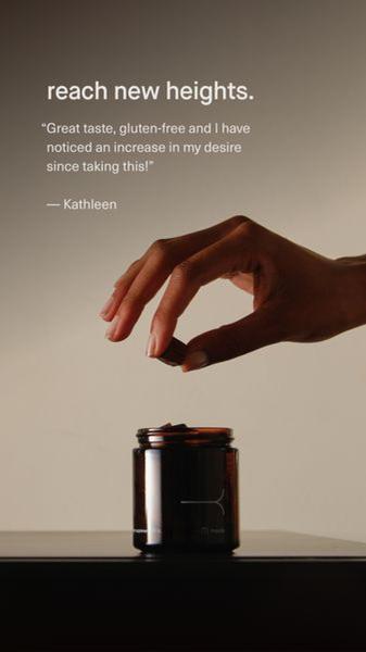





Promer helps you find the pattern, adapt it to your product, and create your own version in minutes.






