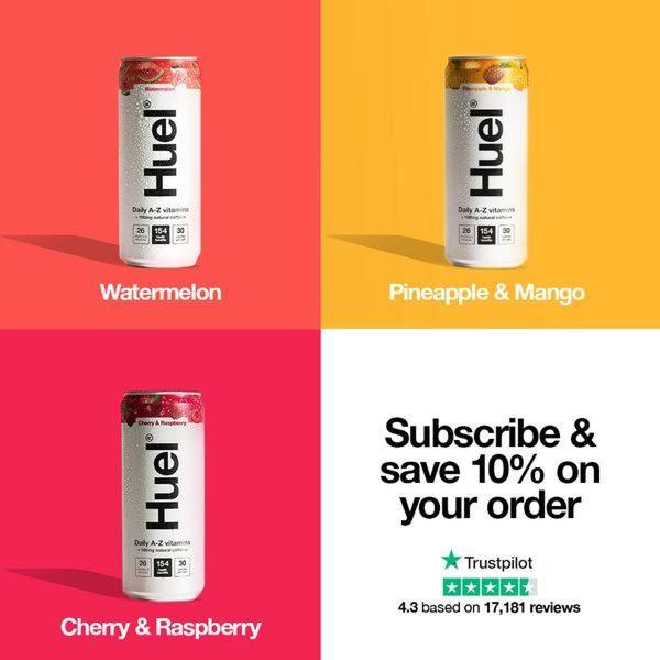
This ad creative features a clean four-quadrant grid displaying different energy drink flavors alongside a strong subscription call-to-action.
Free credits included. No card required
This energy drink ad creative utilizes a high-contrast quadrant grid to instantly showcase flavor variety without overwhelming the viewer. By organizing products into distinct, color-coded sections, the visual layout establishes a sense of order that makes the brand feel accessible and ready-to-consume for the target audience.
This pattern works well for beverage ads because it highlights the breadth of the catalog while pushing a clear, high-intent value proposition like subscription savings. When you use Promer AI to analyze these layout structures, you can test how different color palettes impact click-through rates for your own product sets, which is a common winning tactic in subscription-based marketing.
Great ads are built on a foundation of structural clarity, where the layout does the heavy lifting before the user even reads your headline.
Pro tip
When using a grid layout, ensure your product shadows are consistent across all frames to maintain a cohesive look. This minor detail prevents the ad from feeling like a patchwork of images and makes your brand look more established.



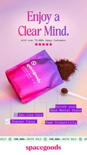

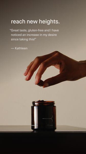
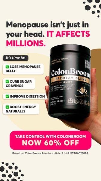
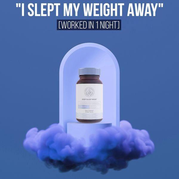


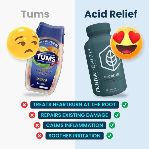
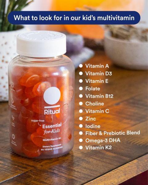
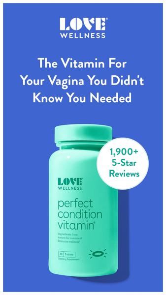


Promer helps you find the pattern, adapt it to your product, and create your own version in minutes.






