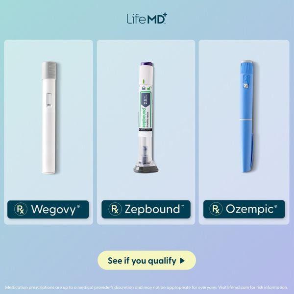
A clean, minimalist 1:1 square graphic comparing three different injectable weight loss pens against a soft gradient background.
Free credits included. No card required
This weight loss pen ad creative leverages a minimalist grid structure to convey clinical authority and accessibility. By stripping away complex photography in favor of isolated product shots against a soft, calming gradient, the ad immediately signals medical legitimacy and ease of use to the viewer. The core strategy relies on the instant recognition of popular products to capture audience attention before leading with a simple qualification call-to-action.
For most marketers, using high-authority visual patterns like this grid is a proven way to reduce cognitive load in highly competitive niches. By using Promer AI, you can replicate this clean, comparative layout with your own products, ensuring your brand maintains the same level of professional polish regardless of your industry. This approach typically performs well when your target audience is already familiar with the category players.
Great ads start from an idea, a feeling, or a structure, not a blank design.
Pro tip
When running comparative creatives, ensure your CTA is benefit-focused rather than just functional. Instead of 'See if you qualify,' test variations like 'Check your eligibility' or 'Find your treatment plan' to see which framing drives higher intent.









Promer helps you find the pattern, adapt it to your product, and create your own version in minutes.






