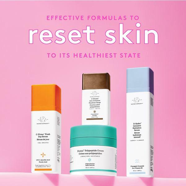
A clean, studio-lit display of four skincare bottles and jars set against a vibrant pink background with bold, centered typography.
Free credits included. No card required
This skincare set ad creative succeeds by leveraging a high-contrast color palette paired with a clear, benefit-driven headline. By placing the products centrally against a solid pink backdrop, the brand creates a clean, premium visual focus that immediately signals simplicity and effectiveness to the viewer. This direct approach removes distractions, allowing the consumer to digest the promise of a skin reset without any unnecessary clutter.
For most beauty brands, this pattern works because it establishes immediate authority and trust. When you use Promer AI to analyze your own assets, you can replicate this balance of typography and product placement to ensure your core benefit is never lost. Keep in mind that while high-key aesthetics often perform well for skincare, testing your specific color palette against your audience's preferences is always recommended to ensure maximum retention.
Great product ads are built on a foundation of visual clarity where the copy serves to amplify the promise rather than compete with it.
Pro tip
When using a bold, solid background like this one, ensure your product labels provide enough contrast to remain readable at small scales. This ensures that even when users are scrolling quickly, the brand identity remains clear and the primary benefit is absorbed in milliseconds.


















Promer helps you find the pattern, adapt it to your product, and create your own version in minutes.






