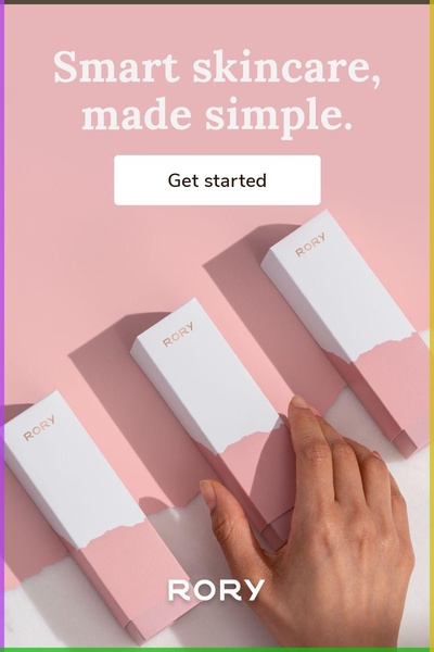
A top-down view of three elegant, color-coordinated skincare product boxes on a soft pastel background, with a hand reaching toward one, emphasizing simplicity and premium aesthetic.
Free credits included. No card required
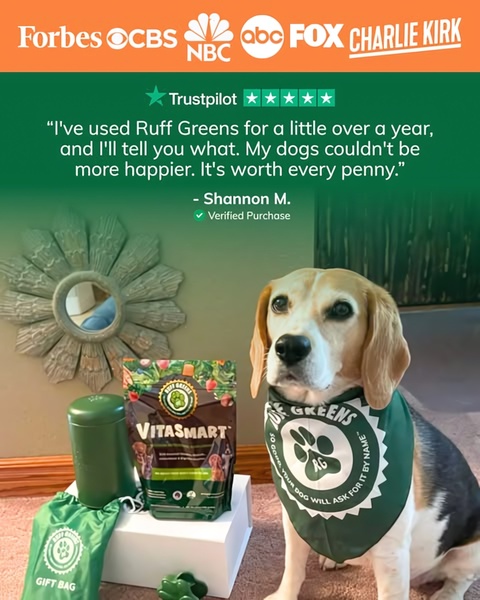
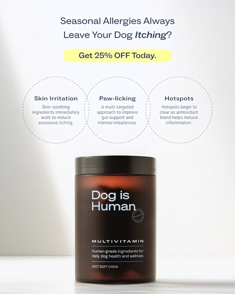
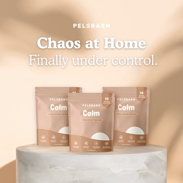
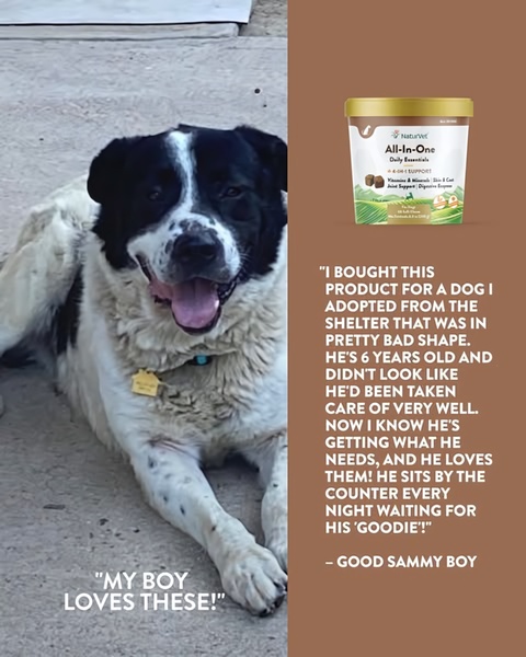
This skincare product ad creative utilizes a minimalist visual strategy to communicate simplicity and quality immediately upon contact. By pairing a clean, high-contrast headline with a soft, cohesive color palette, the ad removes cognitive friction for the viewer, effectively anchoring the brand in a space of premium, accessible self-care that resists the clutter typical of the beauty industry.
Such an approach works well for most ecommerce teams because it prioritizes product recognition and a clear value proposition over aggressive, busy design. Using tools like Promer AI allows teams to replicate this aesthetic balance across various product lines, ensuring that the brand identity remains consistent and the messaging stays focused on the primary benefit.
Great ads start from an idea, a feeling, or a structure, not a blank design.
Pro tip
To increase the perceived value of your skincare products, match the soft lighting in your photography to the dominant colors in your brand identity. This alignment creates a psychological sense of harmony that can influence purchasing decisions.

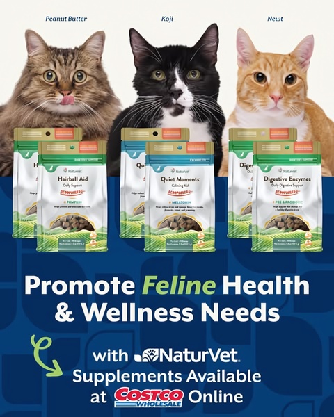

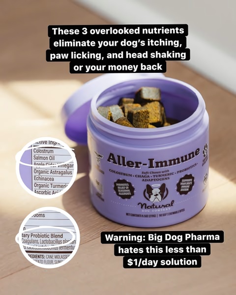

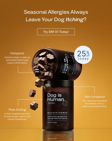










Promer helps you find the pattern, adapt it to your product, and create your own version in minutes.






